Ugly CashThe provocative bank for Latinos in the US
Overview
A bank account, a debit card and an easy way to send money abroad.
Ugly Cash is a fintech company spun out of Reserve to serve the Latino community in the United States. It offers a US bank account with its own debit card. Sending money abroad had no fees and no minimum amounts.
My role. Head of Design, leading Product Design and Brand from zero to launch. Different entities, regulations and features by region had to feel like a single product.
- Role
- Head of Design,
Product + Brand - Scope
- Brand, app, web, cards
- Company
- Best Friend Finance
San Francisco - Status
- Launched
The bet
Remittances, without the remittance.
More money is sent to Latin America from the US than from any other country. Every way to send it shared the same problems: expensive, slow, hard to use, with different rules in every country.
We already knew how to move digital dollars across Latin America, on Reserve's protocol. Ugly Cash put a US bank account on top of it.
To send money between members, in the US and Latin America. No minimum balance, no monthly fee.
Between members, money arrives as it is sent.
01 Money Bastards
A loud name, a refined identity.
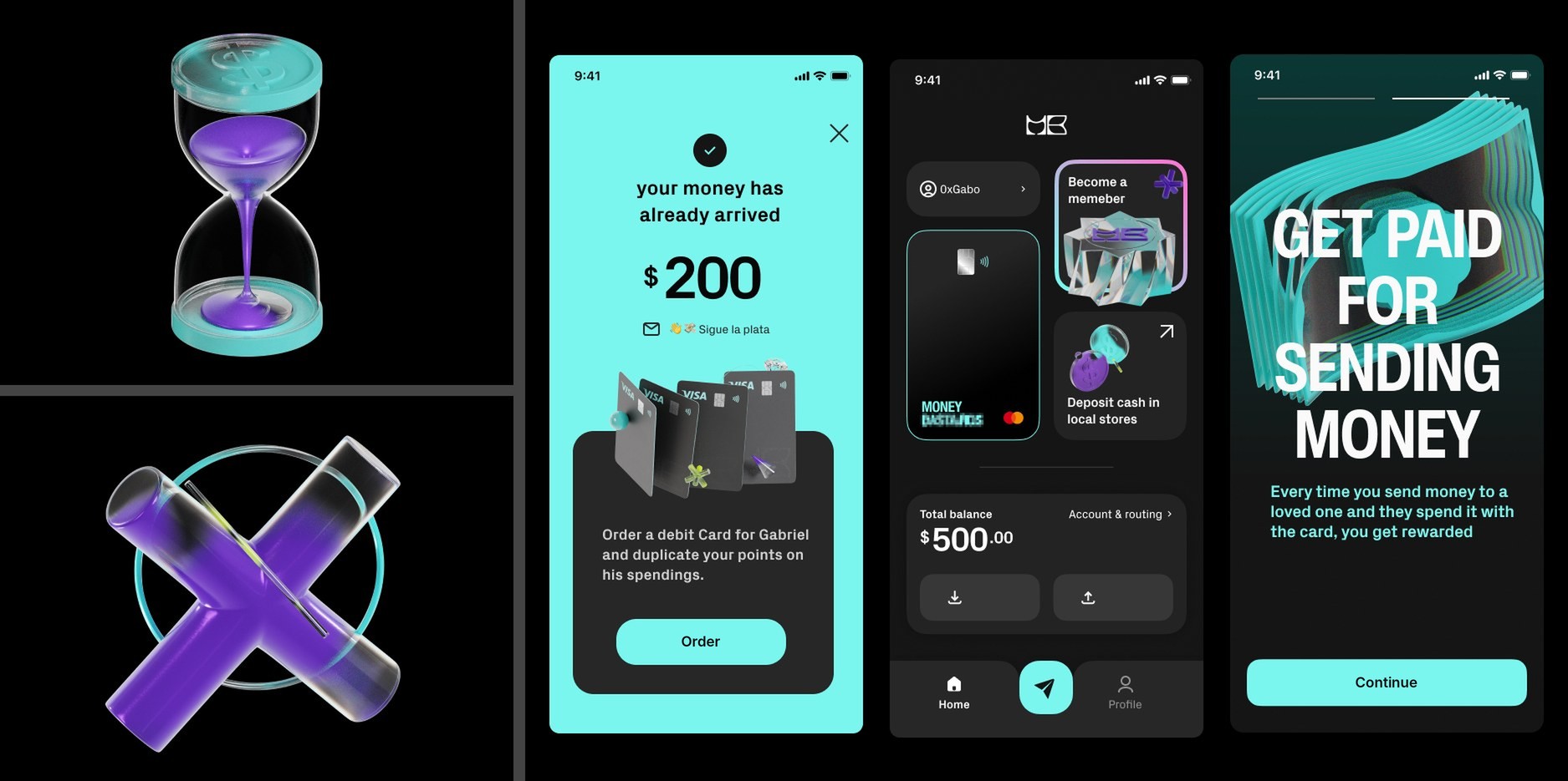
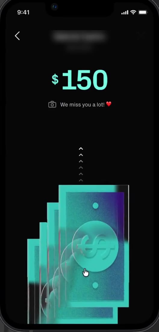
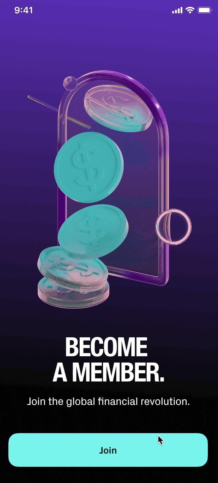
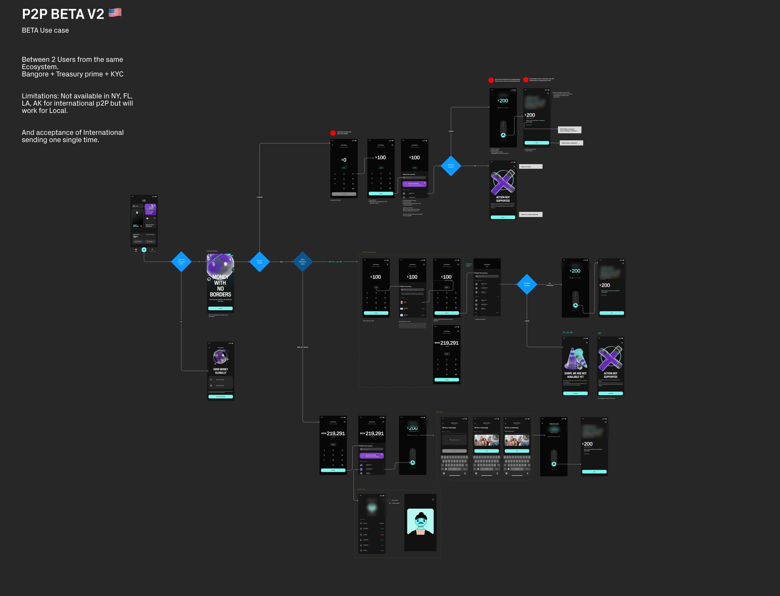
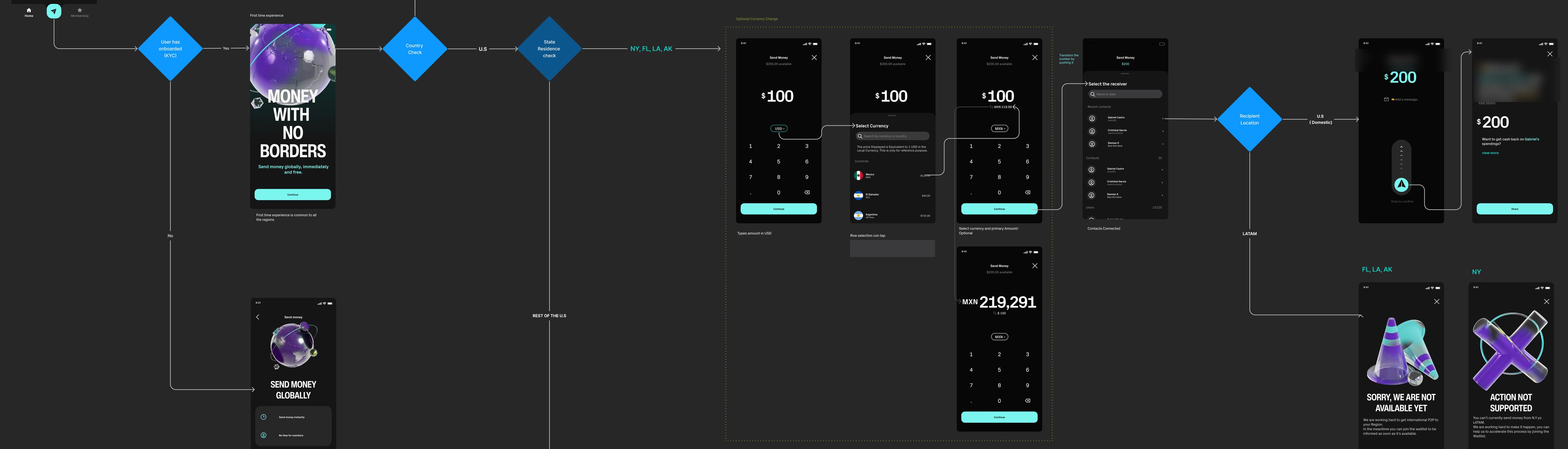
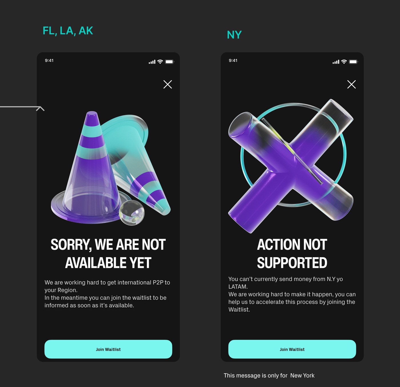
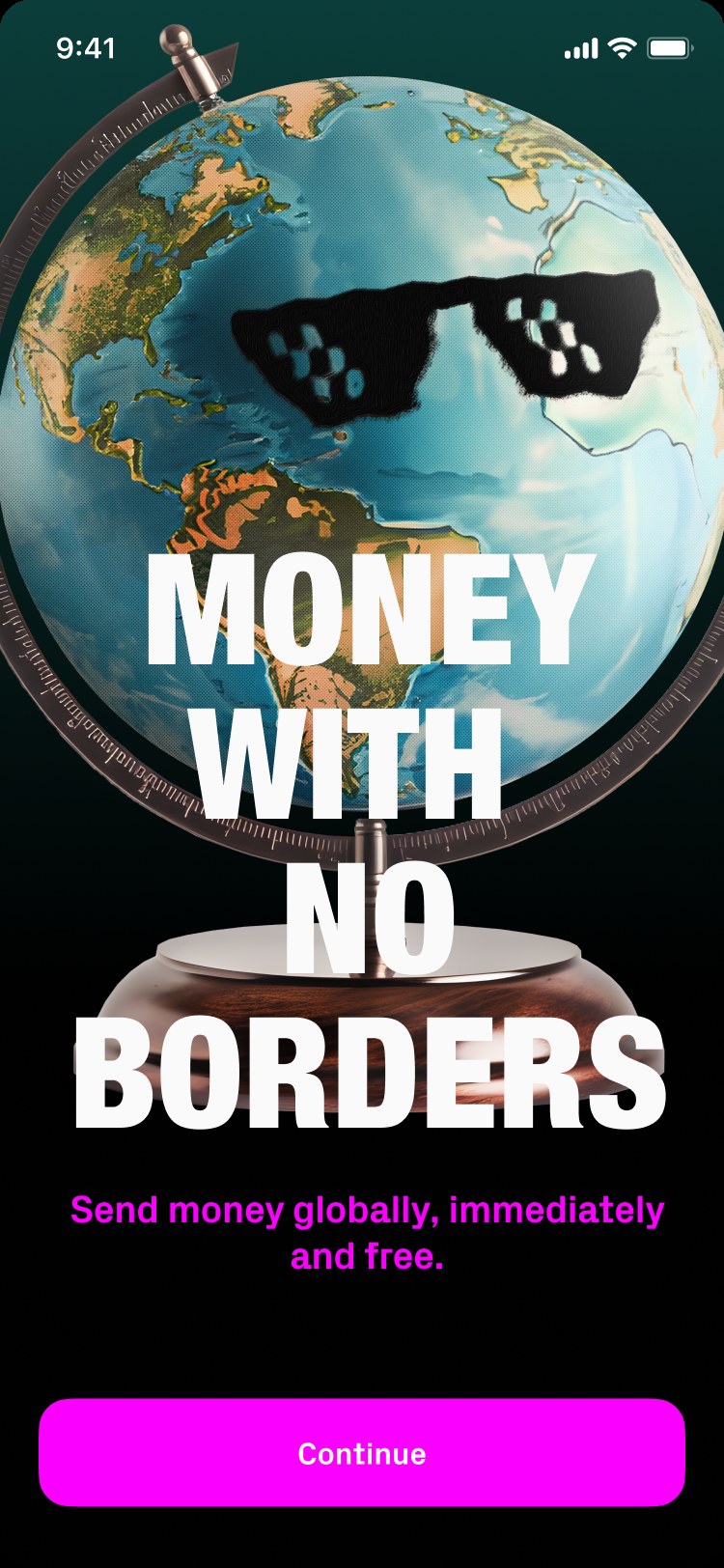
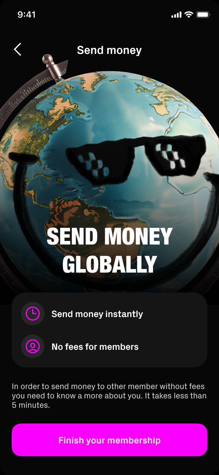
Money Bastards was the first name, and the CEO was convinced of it. I decided to counter it with a luxurious visual identity: refined 3D glass objects in teal and purple, closer to a fashion brand than a bank. An hourglass of money, a cross for errors, bills that fly when you send them.
We built the first product under it: onboarding, the home, the card, peer-to-peer transfers.
The problem
The name banks wouldn't sign.
Neither the potential banking partners nor the card issuer wanted their brand next to our name. After a lot of time invested in the identity and the product, we had to change it completely, and fast.
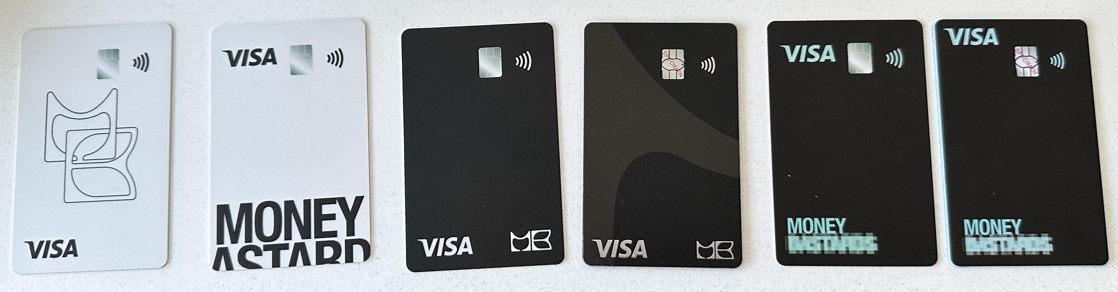
Rebrand
A full rebrand in a few weeks.
Every flow, edge case and component lived in a design system connected to a React Native library. Swapping styles and illustrations was quick, so the whole rebrand took only a few weeks.
02 Ignorant style
Ugly Cash: irreverent but bankable.
We tested names that could provoke without being unbankable. Ugly Cash spoke to young US Latinos with irony, strong enough to carry a brand on its own.
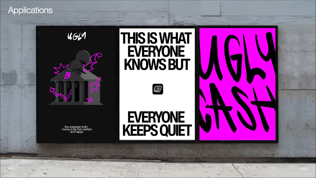
With no budget for a campaign, provocation became our media: niche, guerrilla, made to be shared.
Trade-off. We gave up broad appeal for cheap, earned visibility with one audience.
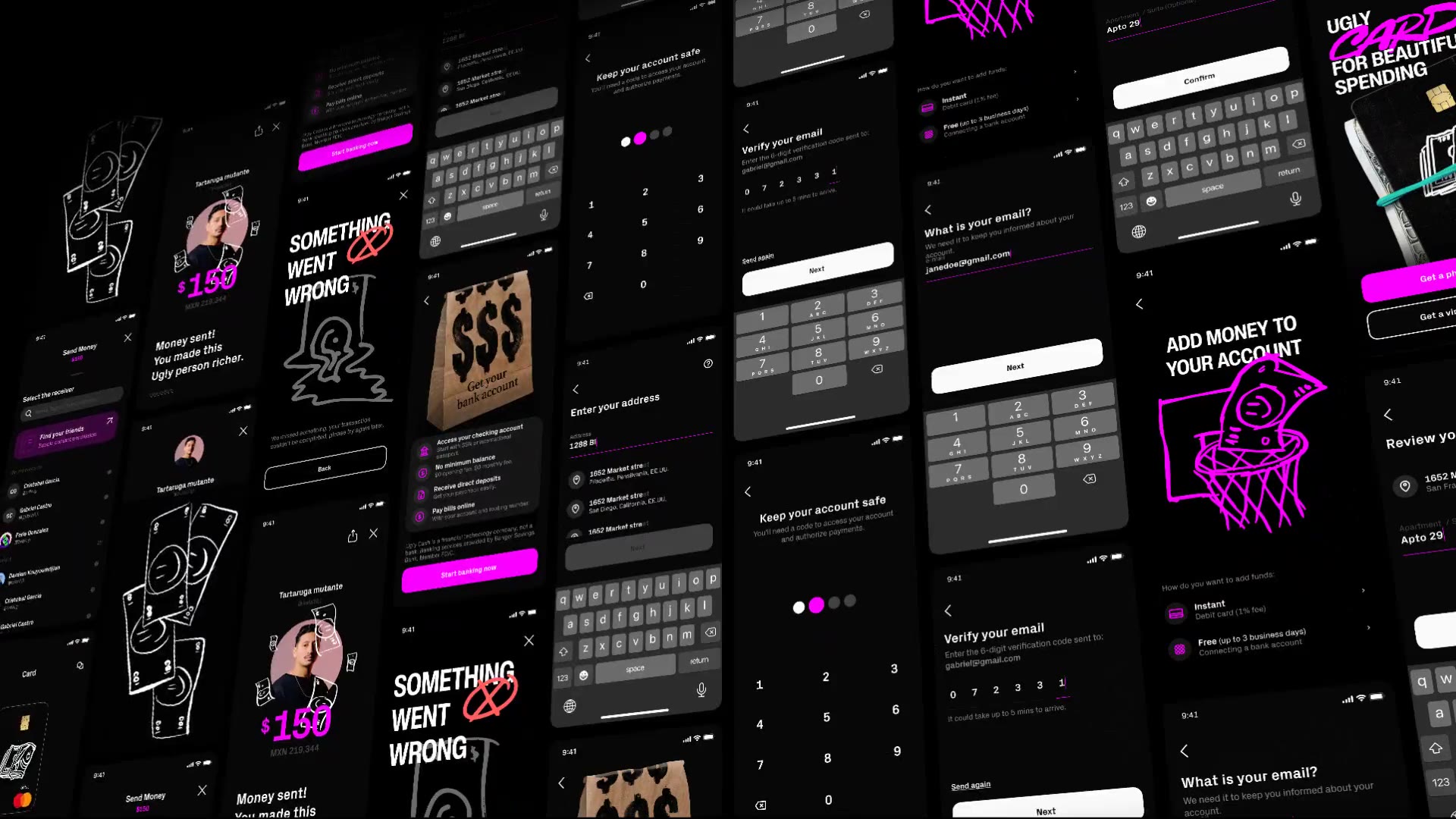
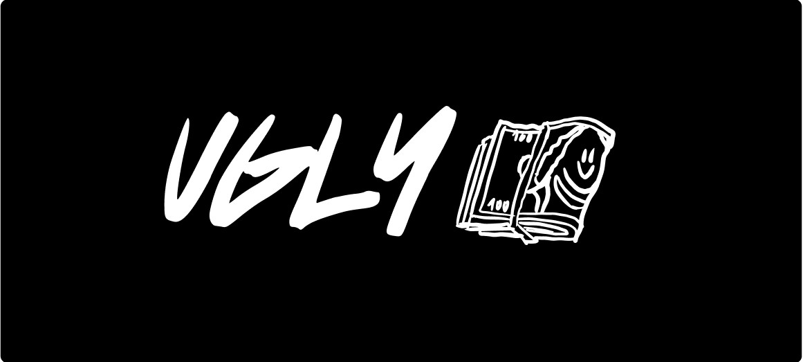
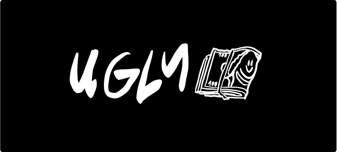
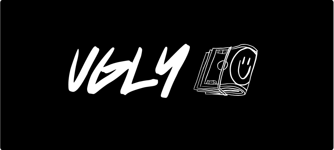
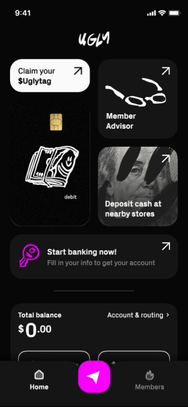
Four principles guided the brand experience:
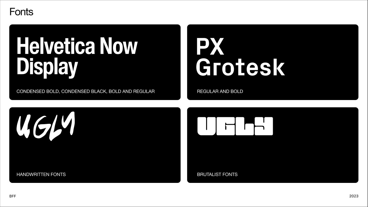
- Brutally honestA simple geometric grid, large type, high contrast. Say the hard truth, even when it breaks industry standards.
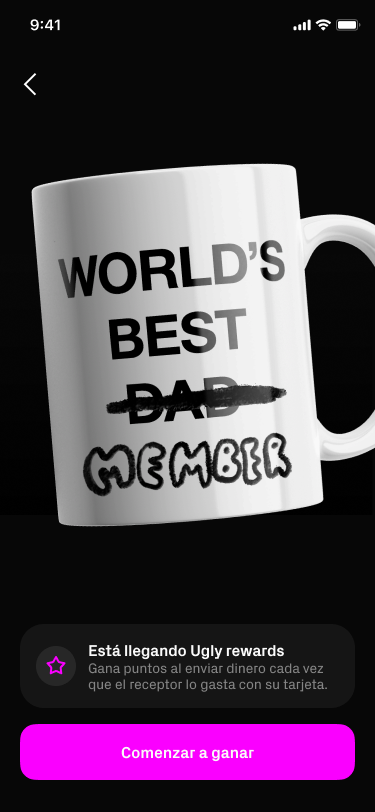
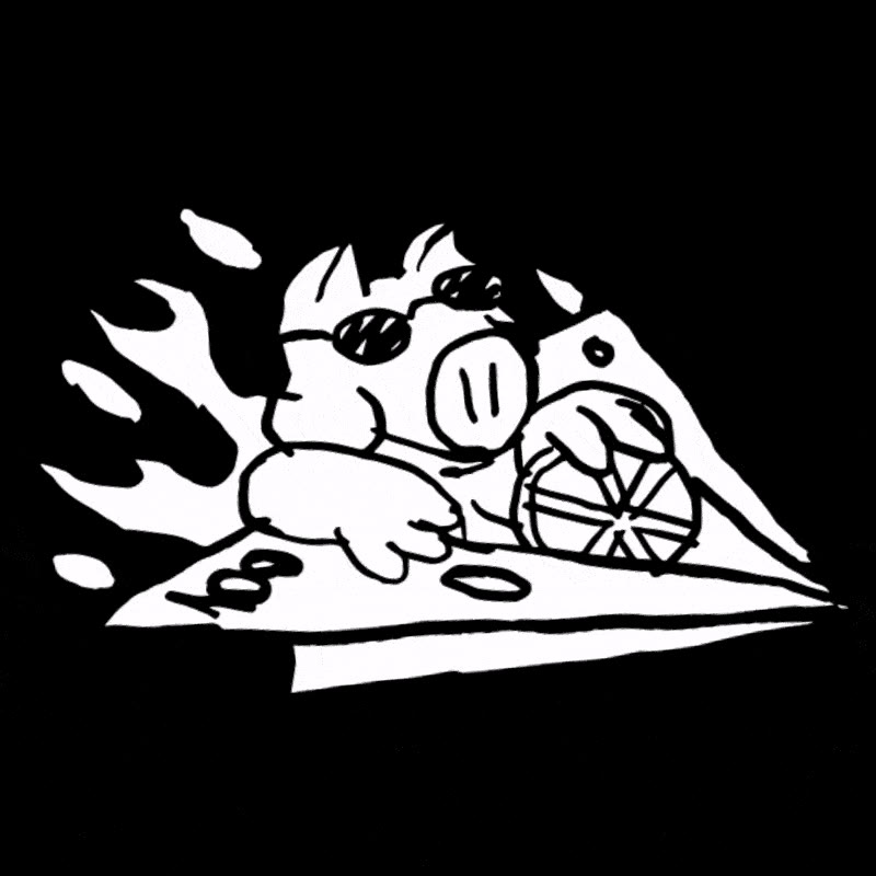
- Shock and amuseAttach the brand to signature moments, with fun, silliness and cheek.
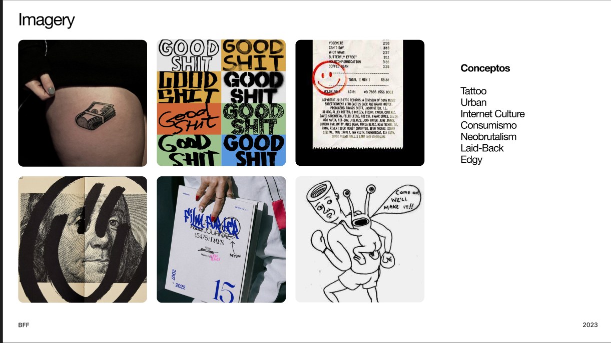
- Imperfect and exoticDissonant details and micro-interactions that set us apart, balanced with usability.
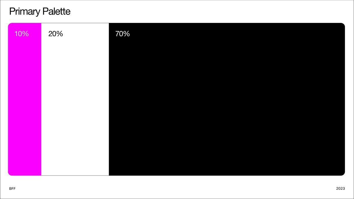
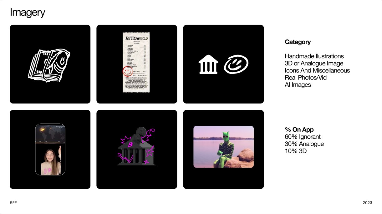
- Form and functionIntention first, then usability: 70% usability, science and logic; 30% art and disruption.
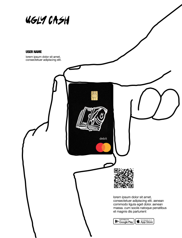
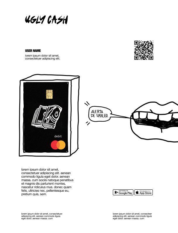
Signature moments
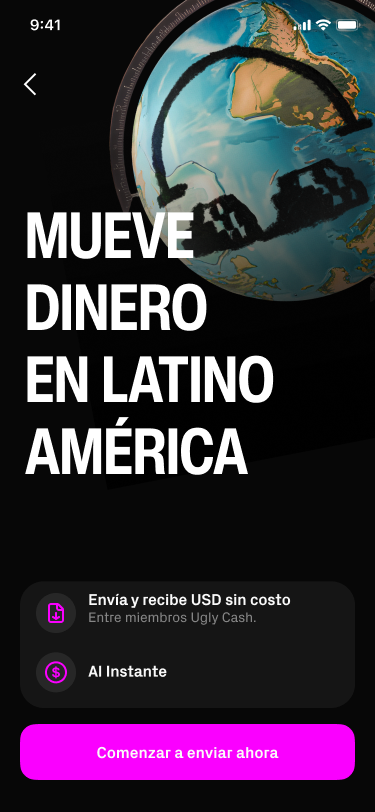
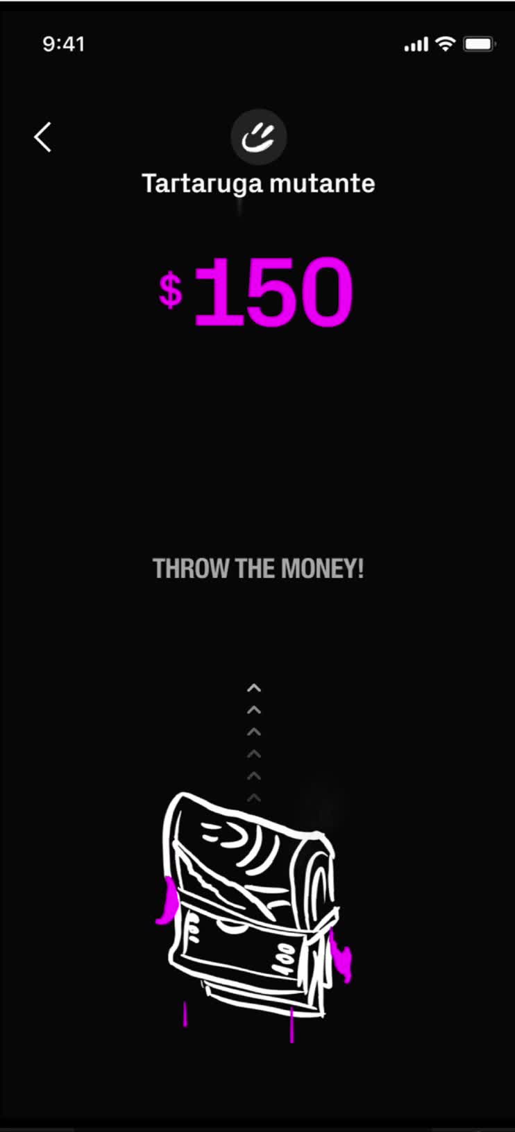
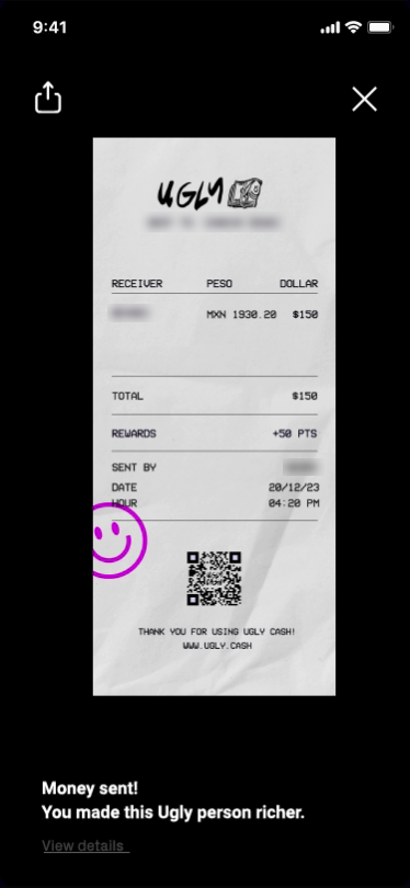
Sending is where the brand speaks loudest.
“You made this Ugly person richer.”
03 Funky brutalism
Turn the volume down.
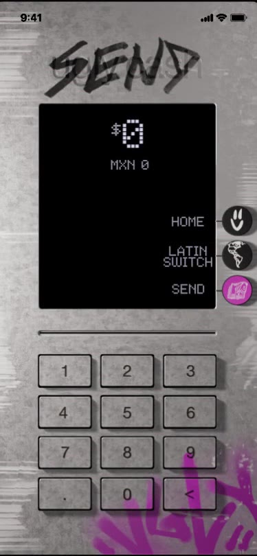
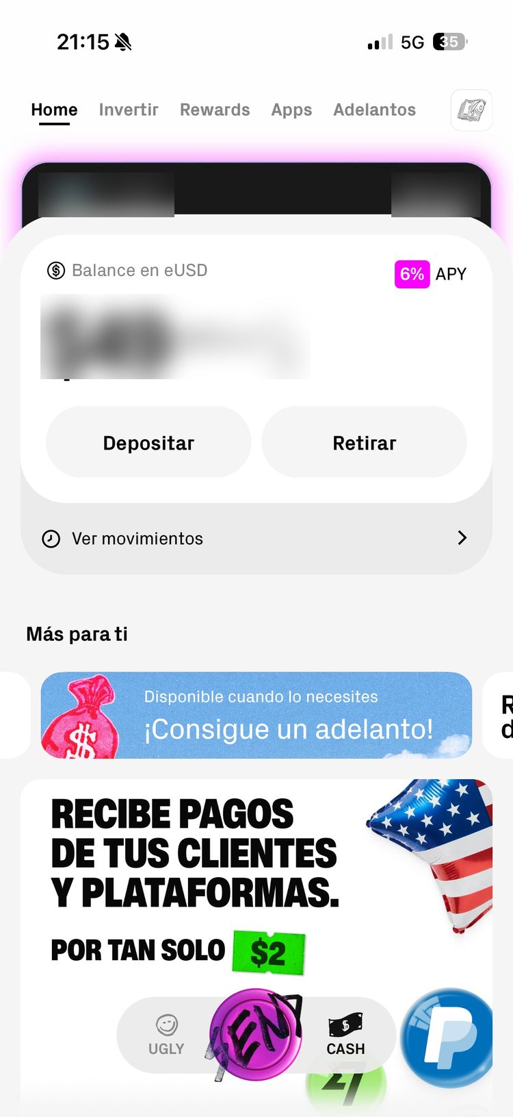
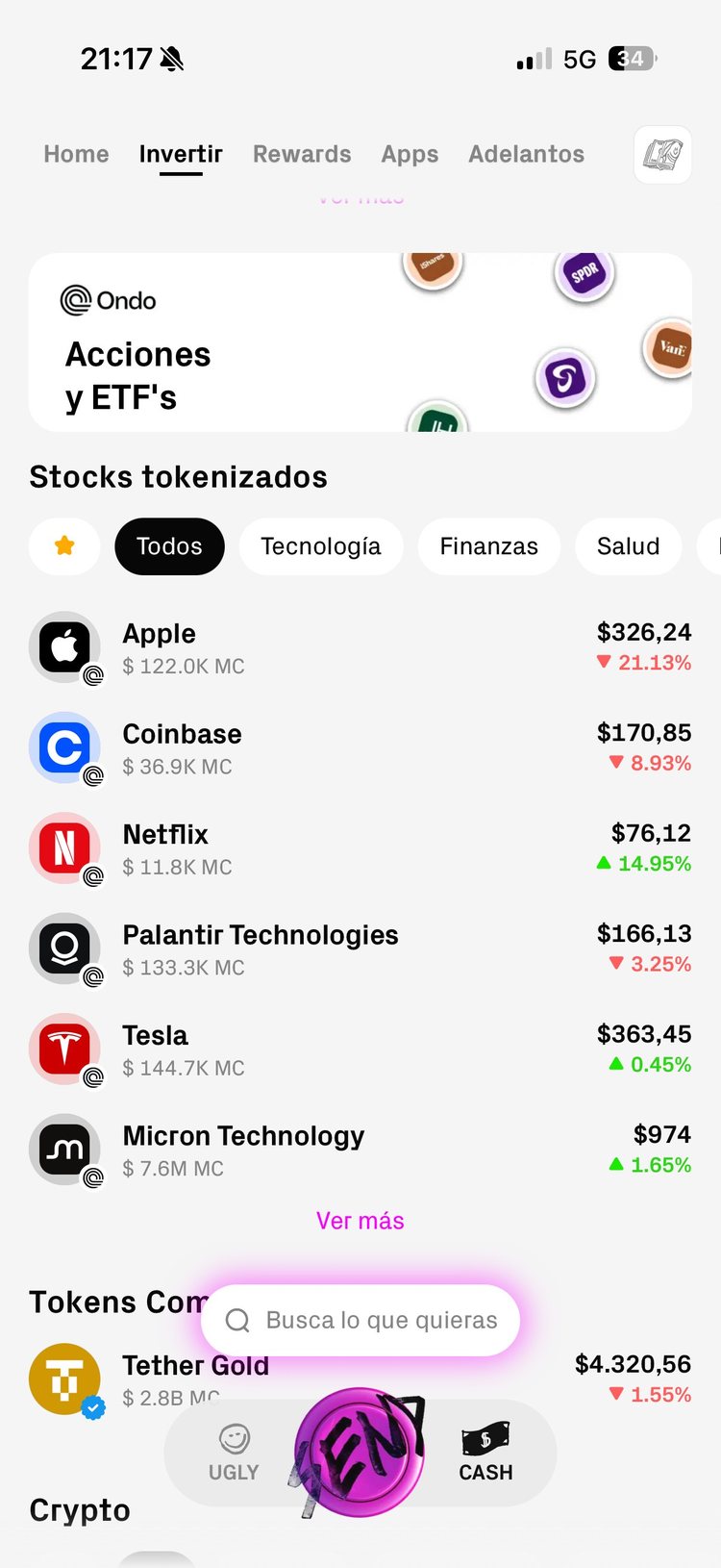
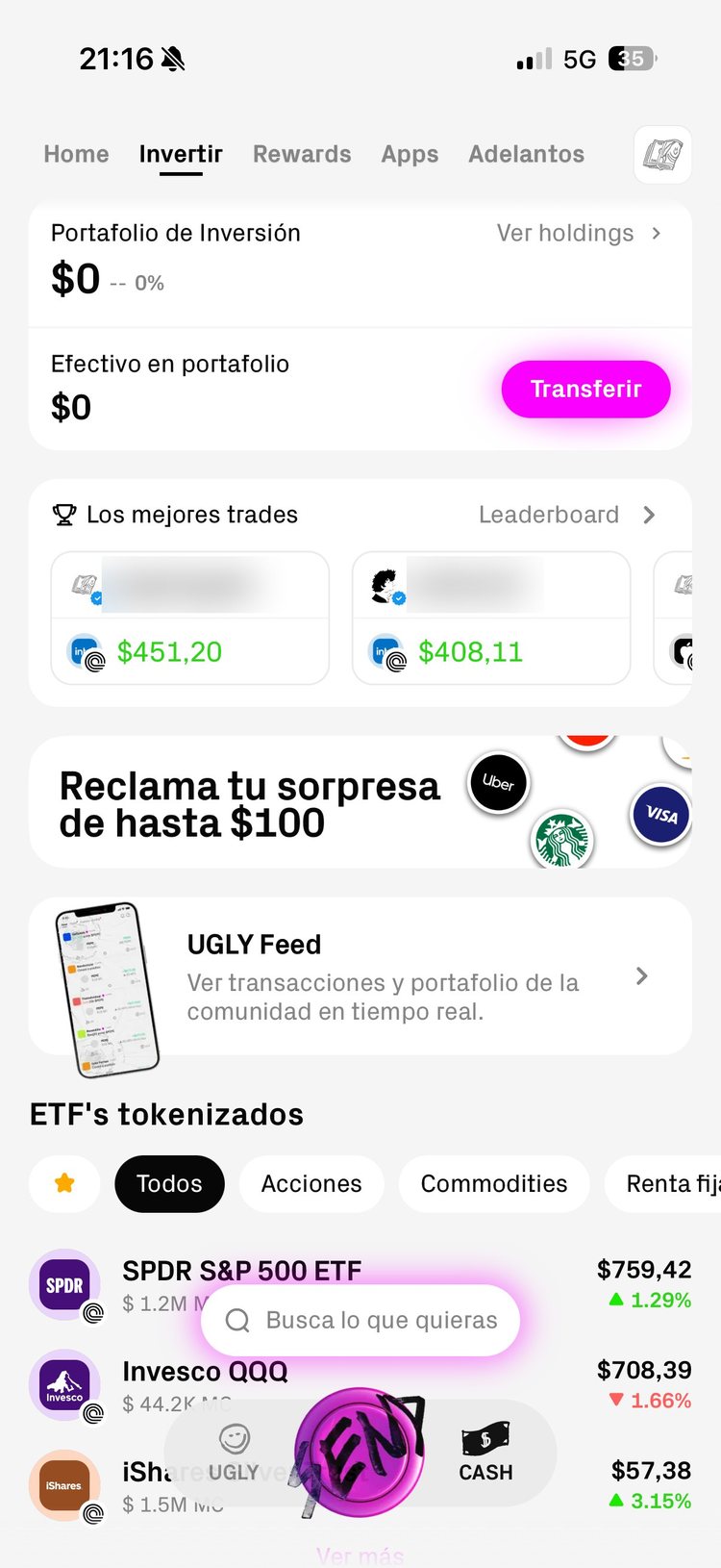
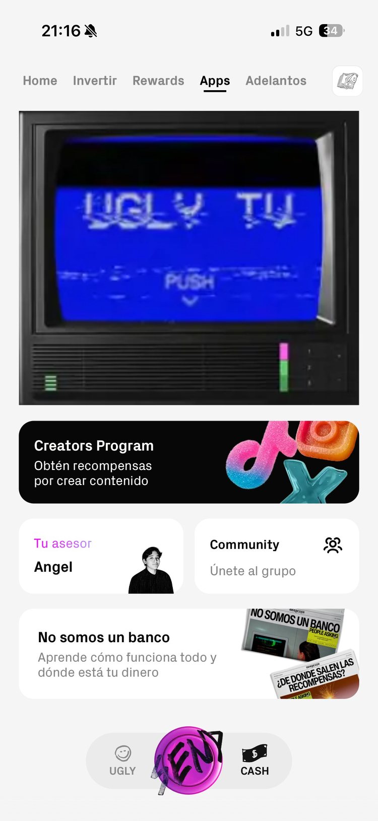
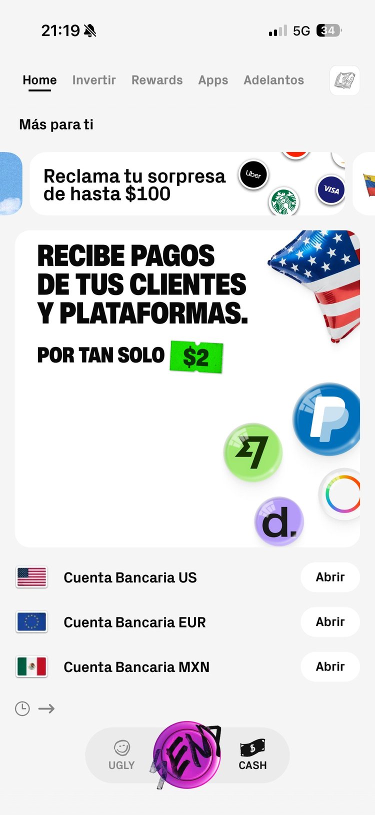
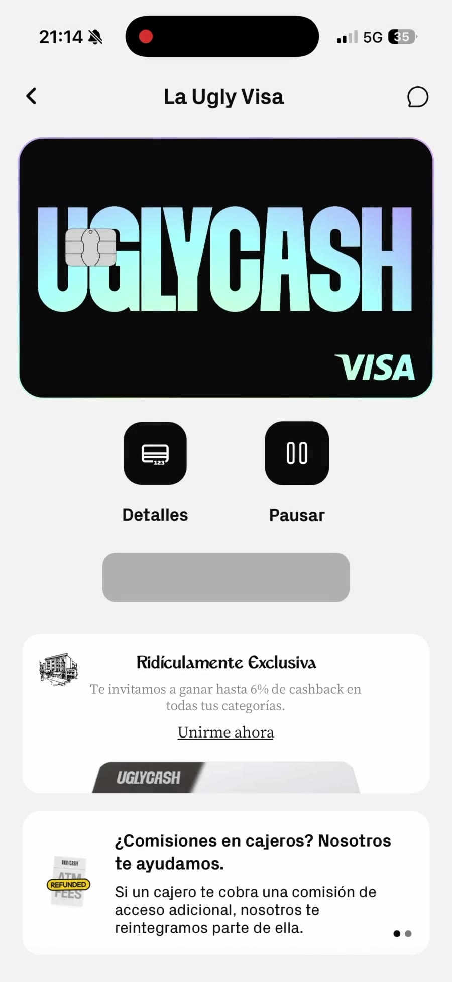
The last stage turned the brand's intensity down to raise simplicity and usability. The interface went white and plain. The identity moved into smaller, memorable details: stickers, objects, the SEND screen.
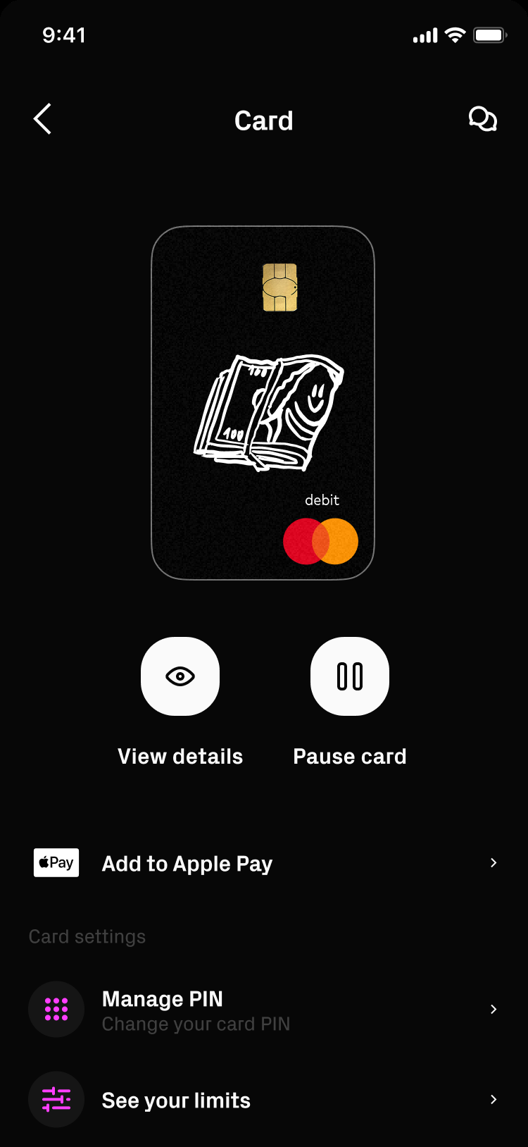
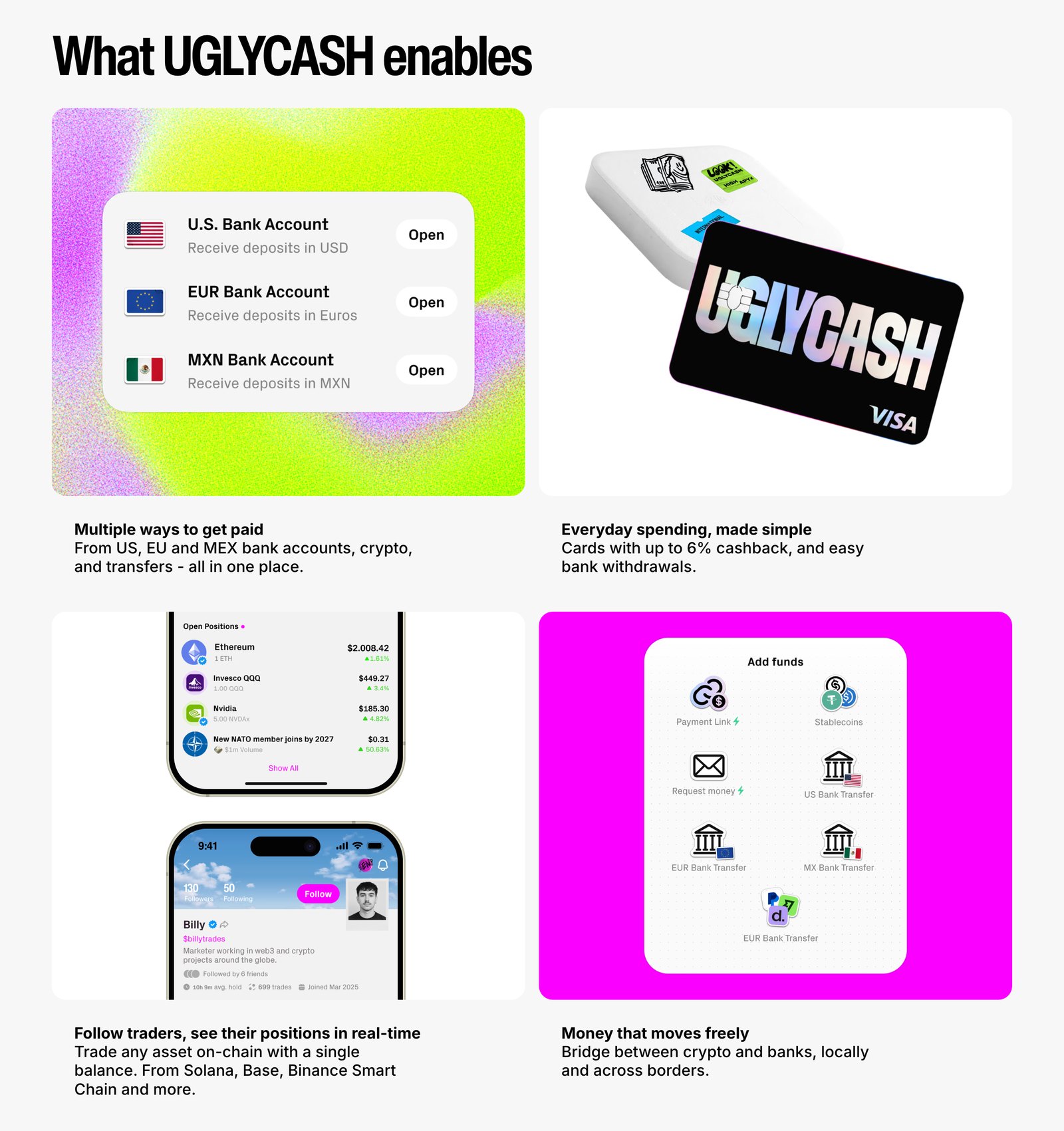
The app grew beyond sending: US, EUR and MXN accounts, the Ugly Visa, investing, rewards.
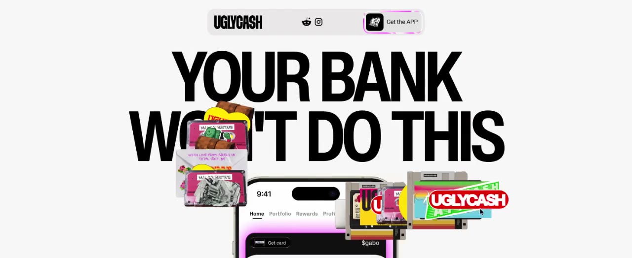
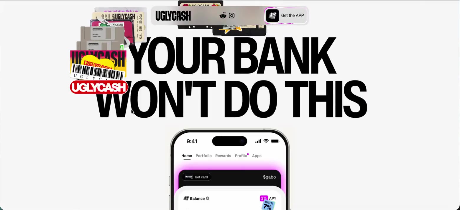
The website carries the same voice: “Your bank won't do this.”
Stage 01
Money Bastards
Provocation in the name. 3D glass objects in teal and purple.
Stage 02
Ignorant style
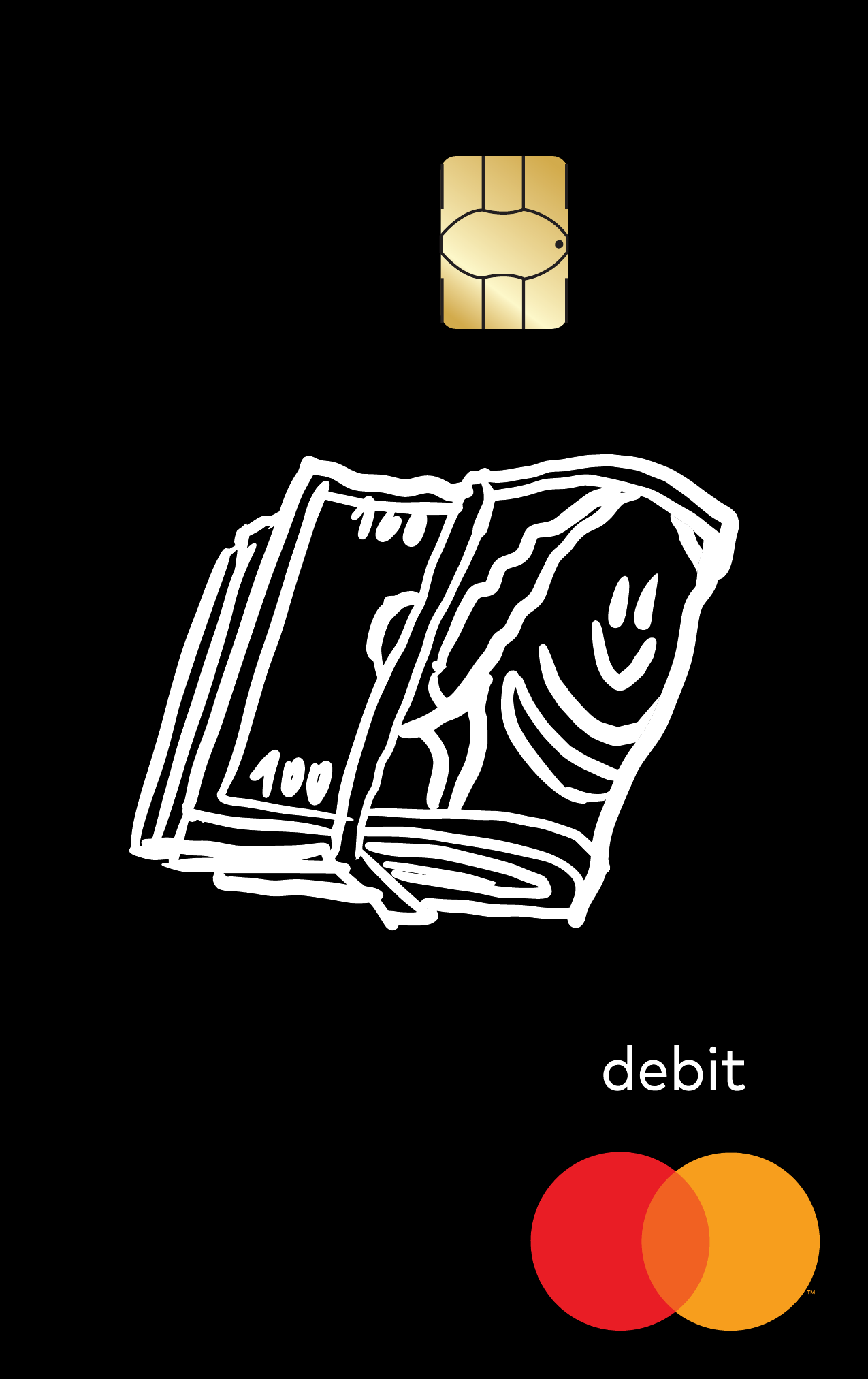
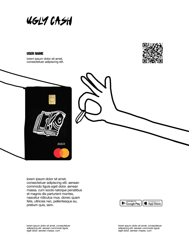
Ugly Cash: a name partners could sign, still ironic. Hand-drawn, raw and loud: half trash, half cool.
Stage 03
Funky brutalism
Brand intensity turned down: simpler and more usable, with the identity in smaller, memorable details.
Outcomes
From zero to a live bank account and card.
Ugly Cash launched in phases through early access.