Fede Gonzalez

UaláFrom a design team
to an experience team
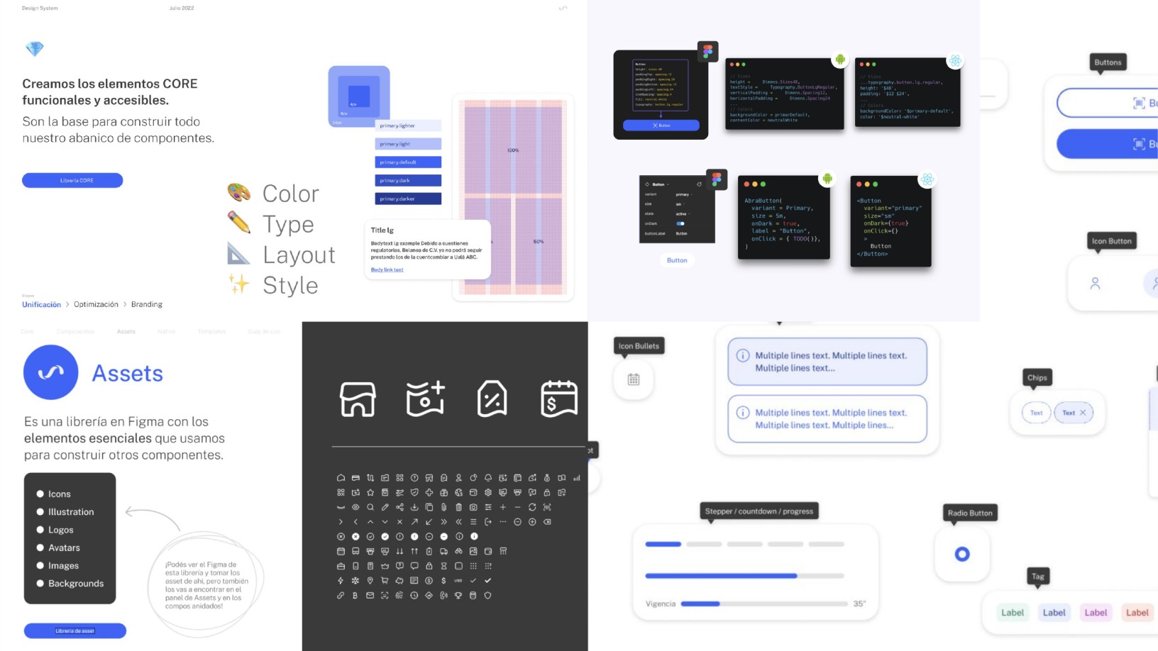
Abra, Ualá's design system: core foundations, the assets library, one button in code for iOS, Android and Web, and components

Overview

A fintech that became a chartered bank.

Ualá started in Argentina. Today it also operates in Mexico and Colombia.

My role. Global Head of Product Design, leading Ualá's design organization: 45 people across Product Design, Visual, Content, Research and Service Design.

Role
Global Head of Product Design
Scope
7 product pools
iOS · Android · Web
Team
45 people
5 disciplines
Markets
Argentina, Mexico
Colombia

Direction

A month in, I presented to the whole UX team and set expectations for the year: a vision, a mission and a first focus, broken down into four pillars.

  1. Vision

    Evolve from a design team into an experience team.

    We brought Service Design into the team. With Marketing, CX and Tech, we started the Experience Map and the physical and digital debit card.

  2. Mission

    Change how we work to get a 360° view of the customer: every touchpoint, across the whole lifecycle.

    We launched a customer segmentation project with Data Science, BI and the business.

  3. Focus

    Start by reorganizing the UX team and how it collaborates with Product.

    Leadership was renewed. We built a career ladder with clear roles and ratios, then mapped how we actually worked with Product. Shared objectives followed.

Translated. From my UX Planning deck, Q1 2022.

Four pillars

From vision to commitments.

Each pillar came with concrete commitments. Talent and Organization went first, then Collaboration and Systematization. Every one of them was done by the end of 2022.

01

Talent

  • Rethink the whole talent lifecycle
  • Hiring: job descriptions and an end-to-end interview process
  • Onboarding run by the UX team
  • Growth: target skill levels, mentoring, courses and cohorts
  • Reviews: self and peer review, goals and how to measure them
  • Retention: measure mood, clear career paths, review salary bands
02

Organization

  • Organizational design of the UX team
  • Chapters with a point of view: Product Design, Visual Design, Research, UX Writing
  • Hierarchy, roles and scope
  • Built to scale: cross-functional teams for Design Ops and the design system
03

Collaboration

  • Rely on processes, not individuals
  • Shared methods and best practices, starting with Product
  • Clear processes and timelines for new initiatives and continuous improvement
  • A cross-functional Design Ops team
04

Systematization

  • A shared glossary, so everyone speaks the same language
  • A scalable design system, documented and integrated with tech and company strategy
  • An information hub with tools, research, boards, templates and artifacts

Organization

Cross-functional projects first, then pools.

We started with three cross-functional projects designed to grow into teams: the design system, the Experience Map, customer segmentation. We redrew the org chart around Leads, pools and chapters. A manifesto defined each discipline's scope.

Then I led the move from squads to product pools.

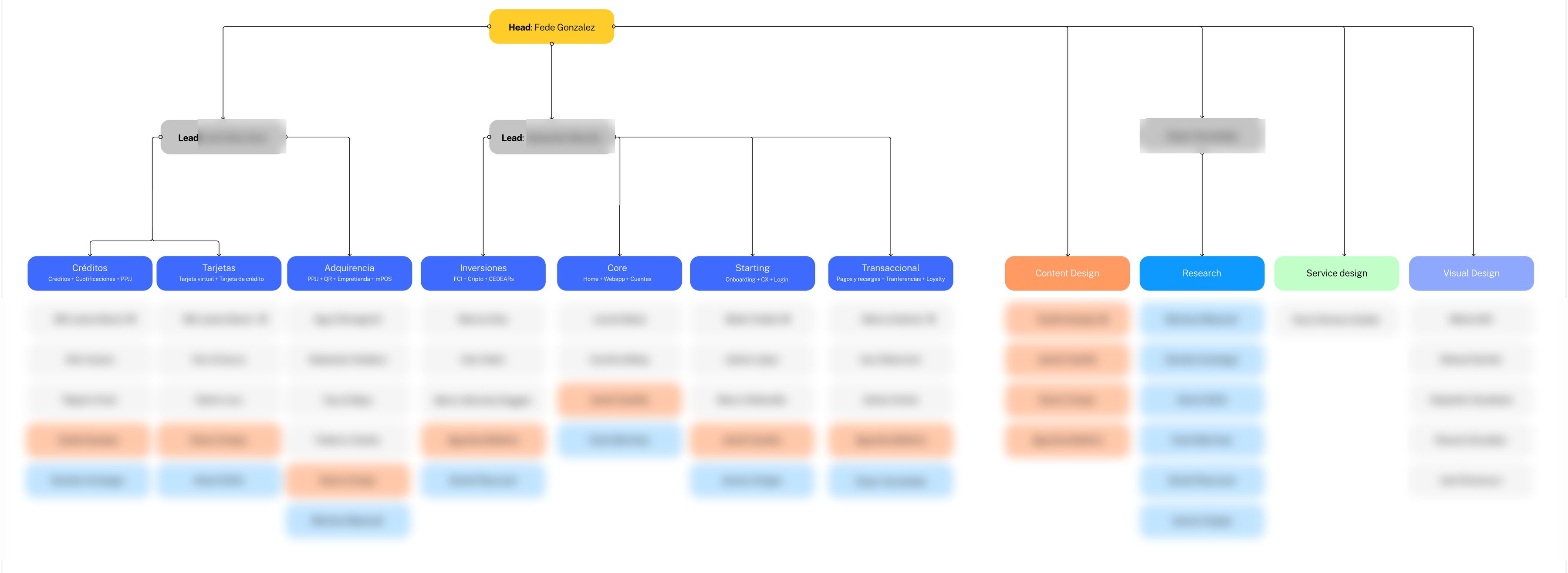
Org chart: Head of the area at the top, two Leads, seven product pools and four chapters for Content Design, Research, Service Design and Visual Design. Individual names blurred.

Pools

Design organized around clusters of products, not squads.

A pool brings together Product Designers, a Content Designer and a Researcher, each with a set share of their time, around two to four related products. It works with its Product, Business and Engineering counterparts. A Coordinator holds it together.

Designers stayed close to their products. Now they also had a team, shared product knowledge and someone to grow with.

Rituals on three levels kept pools from turning into new silos: the whole community, each pool, the Research and Content chapters.

Trade-off. Content Designers split their time between two pools. Coordinators took on management on top of their design work.

  1. 01 PoolTwo to four related products
  2. 02 UX teamDesign, Content, Research by % of time
  3. 03 StakeholdersProduct, Business, Engineering
  4. 04 CoordinatorPart design, part management

Coordinator

We added a rung between designer and lead.

The structure had few steps up, and every departure took a product's context with it. The Coordinator role solved both: a designer who still designs, runs the pool and holds its context.

  • Represent designSpeaks for design in the pool's product meetings, with a 1:1 with each PM.
  • Own the roadmapKeeps the pool's plans up to date across its products.
  • MentorWeekly sessions and 1:1s with the pool's designers.
  • Keep the contextKnows every product in the pool, so they can step in when a designer leaves and keep work moving while a replacement ramps up.
  • Give visibilityReports the pool's status to the Leads.

Coordinators were chosen for performance, experience and core skills by a panel of Leads, Talent and HR. POs and PMs gave input.

Talent

Hiring and growth came first.

We added nine people in Q1 2022. The interview process went down to two rounds up to Senior, and three plus an exercise for Leads. Every job description was rewritten, new roles and existing ones.

The first career ladder, for Research and Product Design, grew into one career site with shared levels across all five disciplines.

+9

New hires in Q1 2022

2

Interview rounds up to Senior

3

Interview rounds for Leads, plus an exercise

5

Disciplines on one career path

Collaboration

Design and Product agreed on a shared way of working.

We mapped how UX and Product actually worked together. Each Product Owner was paired with a Product Designer, and a Design Ops role opened. Cross-functional work followed.

  • Experience MapCX, Marketing, Business, Research, Content and Product Design scored 46 pain points, then prioritized 24.
  • Ideation10 stakeholders from 4 areas produced 20+ solutions in 8 hours; 2 were documented for implementation.
  • ResearchA monthly newsletter shared every study. Marketing, BI and CX started coming to Research with their own questions.
  • Design OpsA Design Ops team built the UX onboarding, a toolkit of methods and a documented design process.
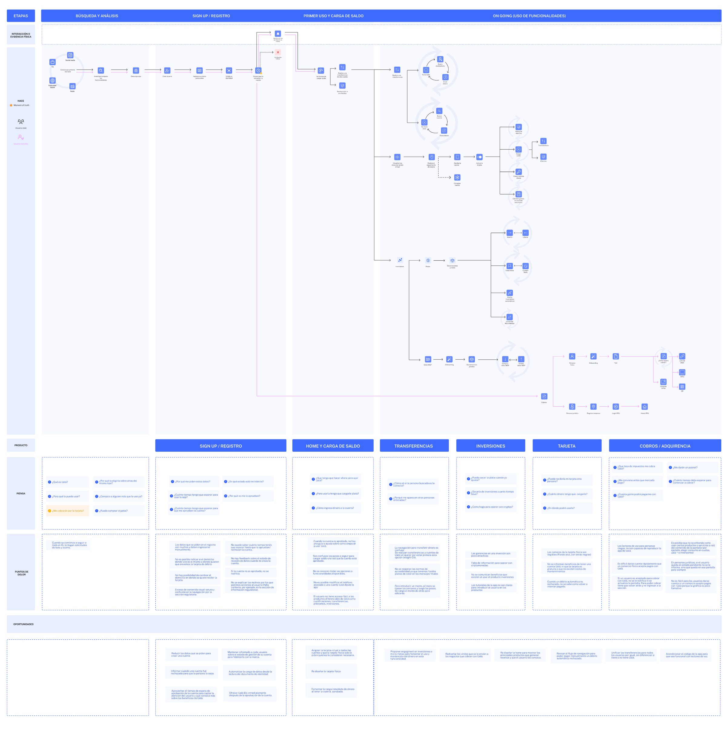
The full As-Is Experience Map: stages across the top, customer actions, products, thoughts, pain points and opportunities in rows
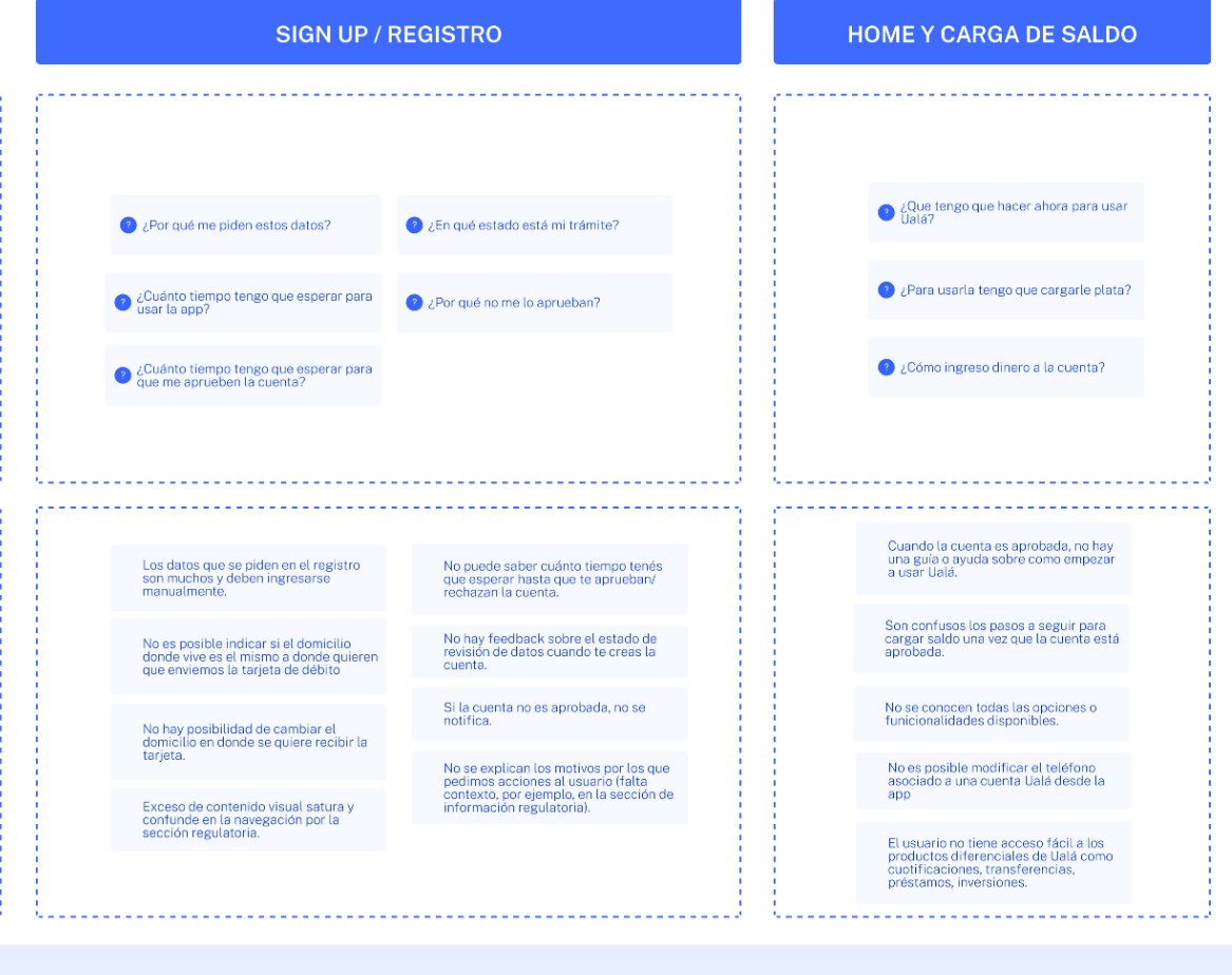
Detail of the map: customer questions and pain points for sign-up and first top-up

Systematization

One language: unify first, then improve.

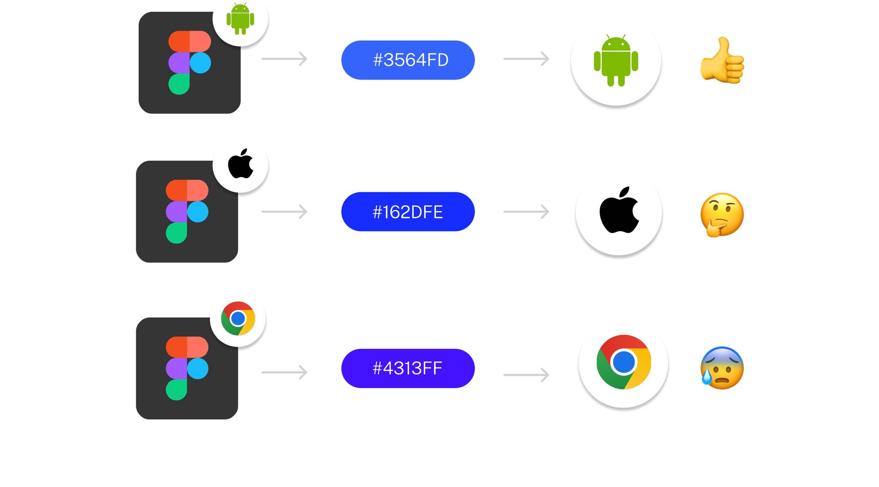
Early in the year the design system was still in discovery. The Visual team audited the app: the same function was solved many different ways, and the brand blue had three different hex values. We chose to unify what already existed before redesigning any of it.

Trade-off. The visible redesign had to wait; consistency came first.

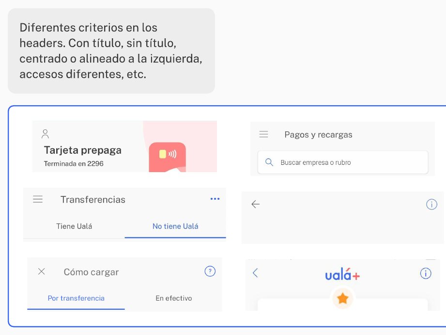
Audit board: six header variations from the live app, with and without titles, centred or left-aligned
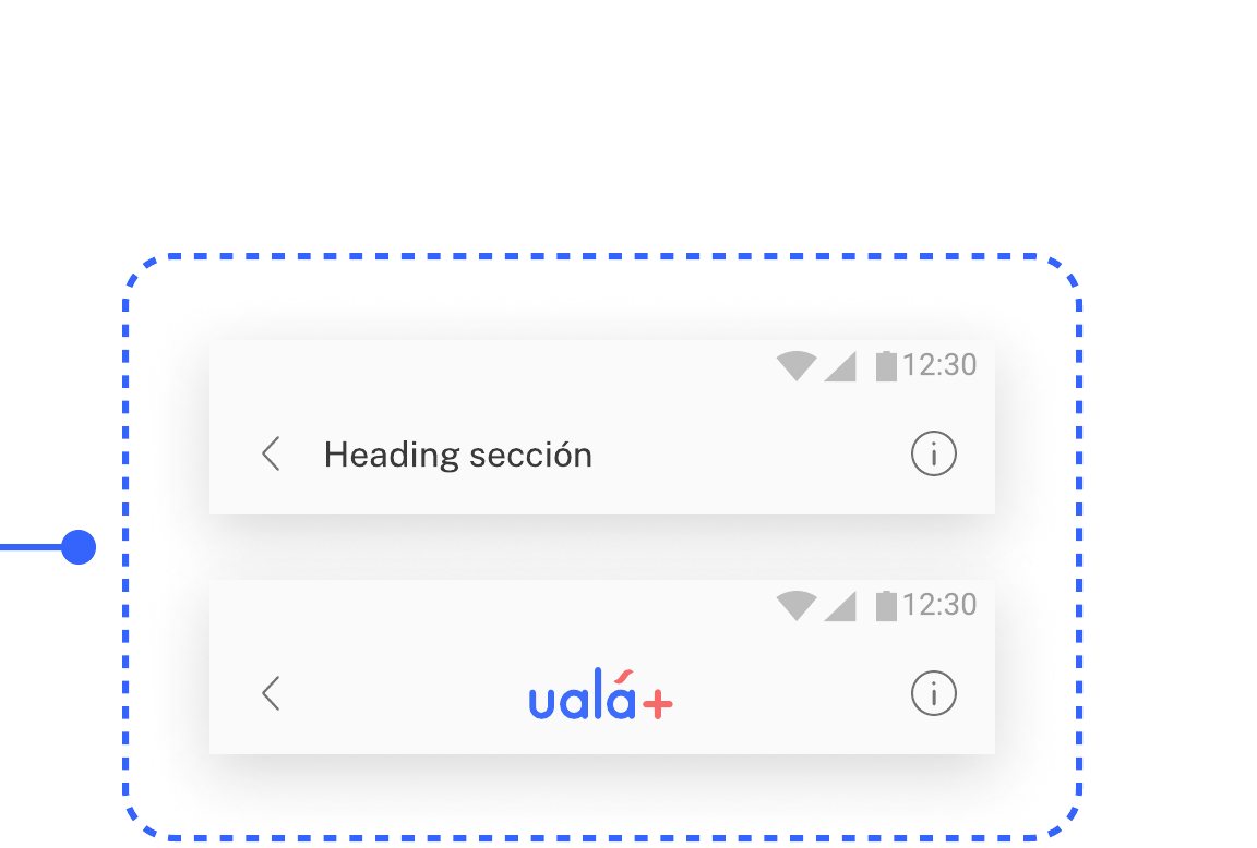
The unified header component, shown in its two variants
Figma to Android, iOS and Web: three different hex values for the same blue
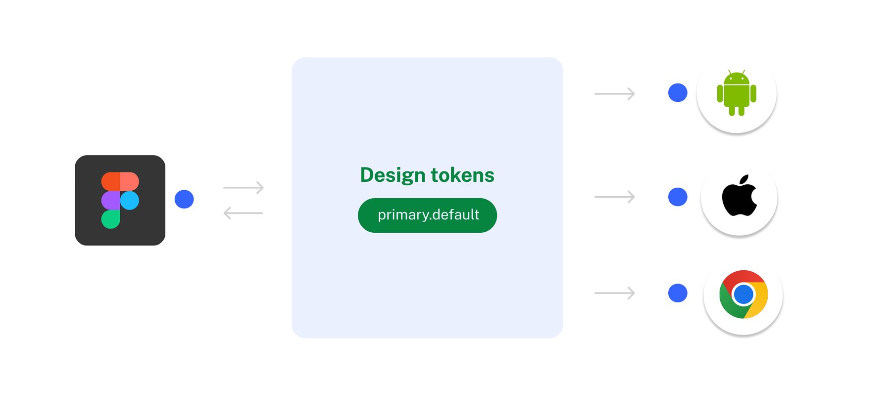
Figma feeding a design token, primary.default, which feeds Android, iOS and Web

Abra

The design system became Abra.

A team of five built the core foundations, a four-level component library and a usage guide for designers. Abra was presented to the whole UX team in October 2022.

14

Atoms

The smallest controls.

  • Button
  • Icon button
  • Input
  • Checkbox
  • Radio button
  • Switch
  • Chip
  • Tag
  • Tooltip
  • Stepper
  • Slider
  • Option picker
  • Indicator bar
  • Avatar
9

Components

Atoms combined into reusable parts.

  • Rows
  • Card
  • Select
  • Search bar
  • Tab
  • Message
  • Quick actions
  • Content module
  • Security access
7

Modules

Screen-level structures.

  • Header
  • Navigation bar
  • Side bar
  • Highlight
  • Empty state
  • Numpad
  • Graphics
11

Templates

Full screens, ready to adapt.

  • Transaction detail
  • Checkout
  • Profile
  • Feedback
  • Timeline
  • Walkthrough
  • Form
  • Menu
  • Loading
  • Security access
  • Basics

Content

Words became part of the system.

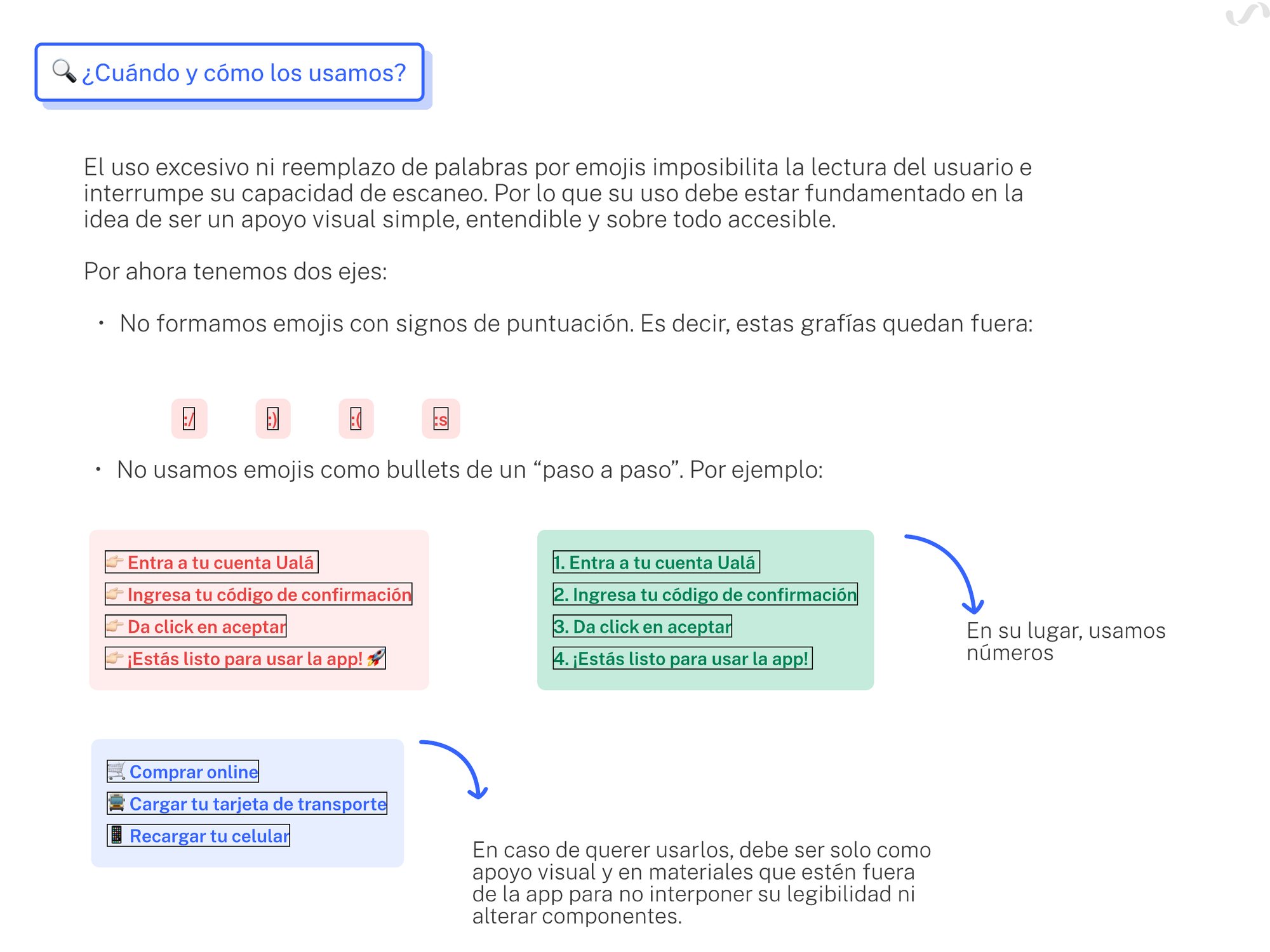
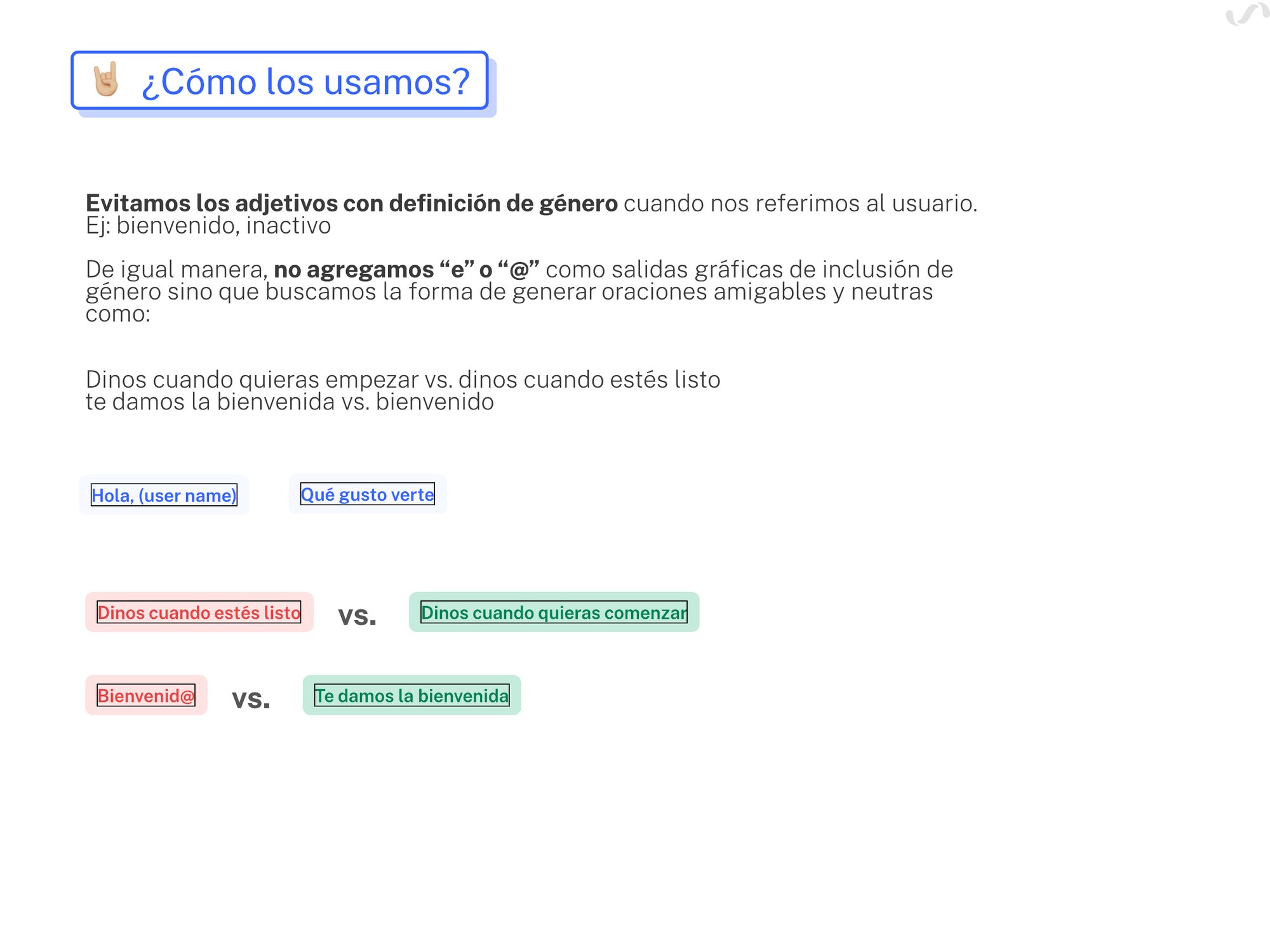
The first voice and tone manual grew into a writing style guide for Product Designers: when to use emojis, how to address users without gendered adjectives, and why to write in the active voice.

Style guide page on emoji use, with right and wrong examples
Style guide page on adjectives: avoid gendered adjectives when addressing the user

Plan to delivery

Every commitment was reported back at the UX Summit.

At year-end, each discipline shared the goals it had reached. Most trace straight back to that first presentation.

  1. PillarPlanned · Q1 2022Delivered · UX Summit, Q4 2022
  2. OrganizationOrganizational design of the UX team; cross-functional projects that grow into teamsSeven product pools, with Content Designers formally assigned to them
  3. TalentA first career ladder for Research and Product DesignOne career site for all five disciplines
  4. CollaborationCX Map project; Service Design joins the teamExperience Map: 46 pain points mapped, 24 prioritized with CX, Marketing and Business
  5. CollaborationHire for Design OpsDesign Ops: a UX onboarding and a documented design process
  6. SystematizationDesign system in discoveryAbra: core foundations, a component library and a usage guide
  7. SystematizationVoice and tone manual v1; a writing guideA writing style guide for Product Designers
  8. SystematizationUX Hub v1The Hub: a toolkit of methods, techniques and tools for each design stage

Evidence

What the organization delivered, and what changed in the product.

Delivered in 2022Outputs reported by the team

700+

Users in research studies

21

Research projects in Q1–Q2, across 3 countries

24/46

Pain points prioritized across functions

7

Product pools

Changed in the productResults reported by the pools

54→92%

Users entering Challenges who also opened Levels, after the Loyalty header redesign

38→50%

Users who entered Challenges after the same redesign

+10pp

More FAQ visits with the new help search, with no change in contacts to support

Learnings

Write the direction down, then build the structure.

  • Diagnose firstThe pools came from naming what the old structure was costing us.
  • Growth is structureA clear next step within each pool mattered as much as the org chart.
  • Shared ground scalesOne system and one map gave seven pools the same starting point.