Fede Gonzalez

R/GAThe rga.com redesign, built on evidence

Landing page section: A/R Jordan

Overview

Before redesigning the site, we looked at how people actually used it.

The audit combined analytics, heat maps, search data, persona surveys and a competitive review.

Among the recommendations: simplify the language and the UX, let each office tell its own story, and attract new audiences.

Role
Group Creative
Director @R/GA
Scope
UX strategy,
web design
Client
R/GA
Year
2020
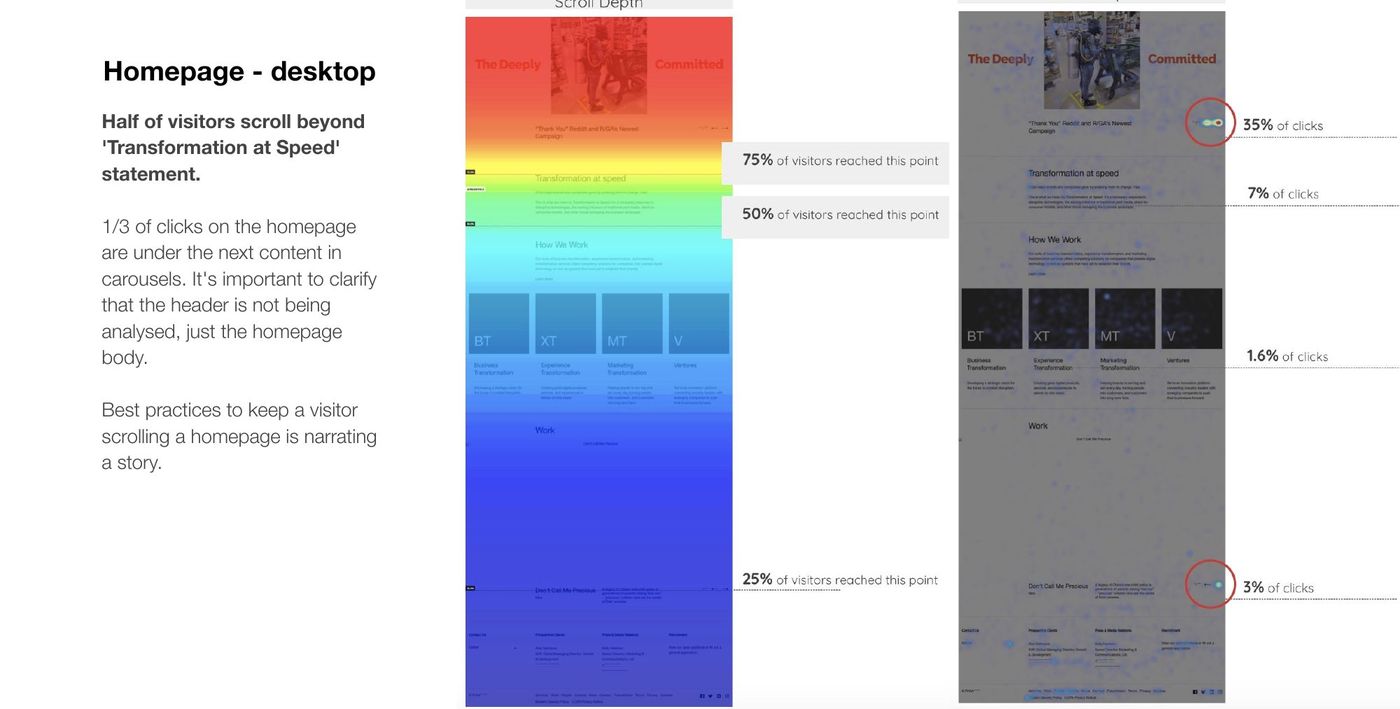
Home page, desktop: scroll depth and click map
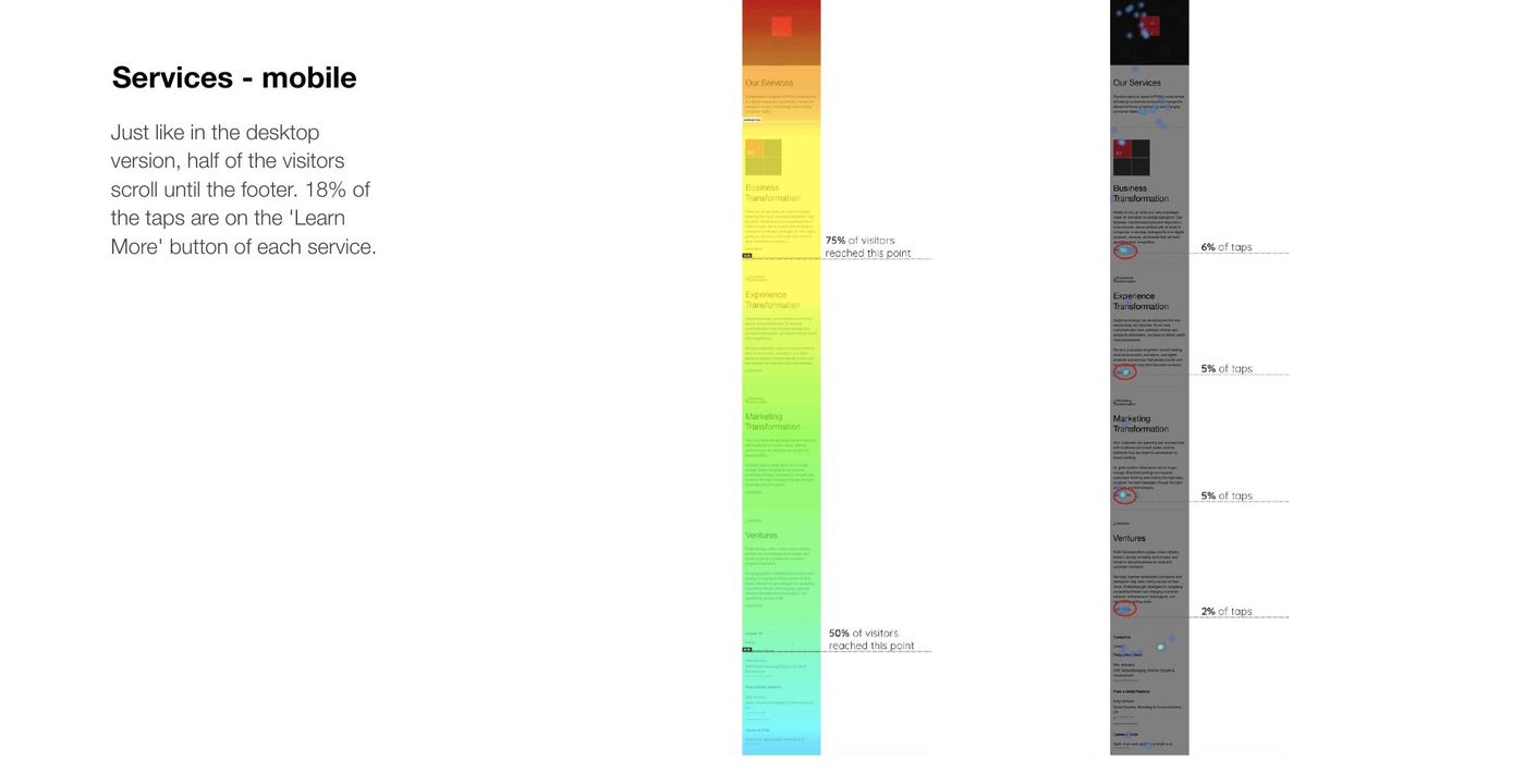
Services page, mobile: scroll depth and tap map
~5%of search traffic came from work-related terms without the R/GA name
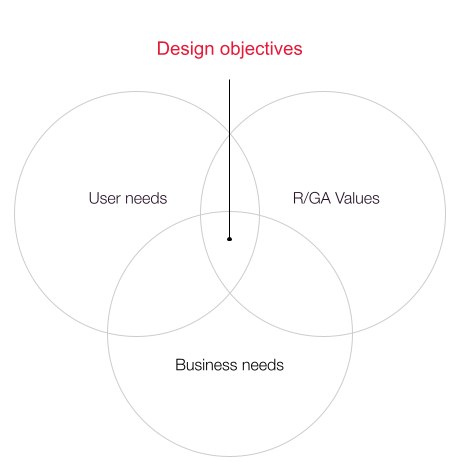
Design objectives: user needs, R/GA values and business needs
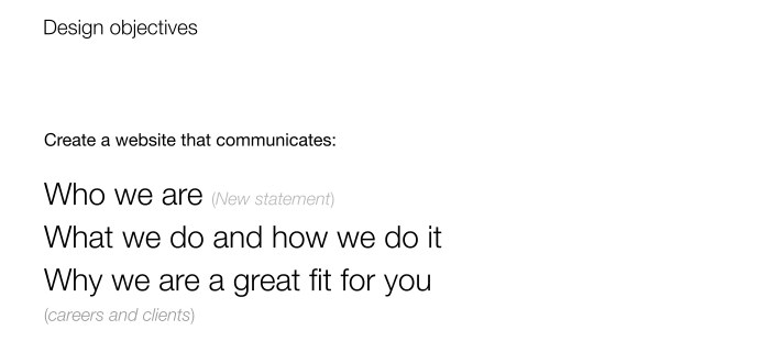
Design objectives: who we are, what we do and how, why we are a great fit
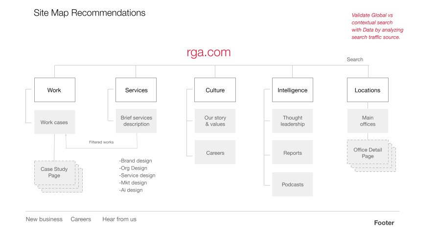
Site map recommendations
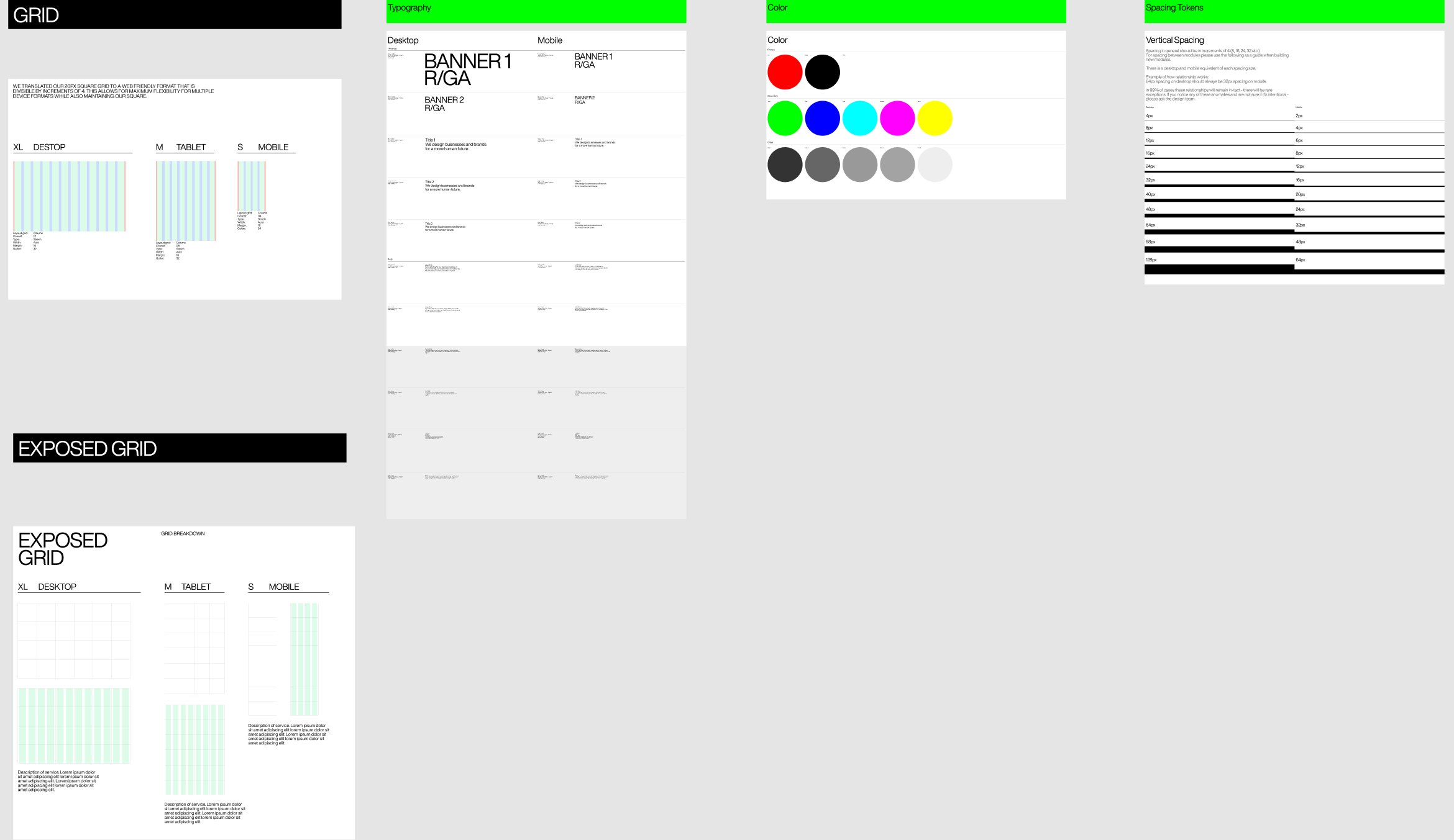
Dotcom design system foundations: grid, type, color, spacing and aspect ratios
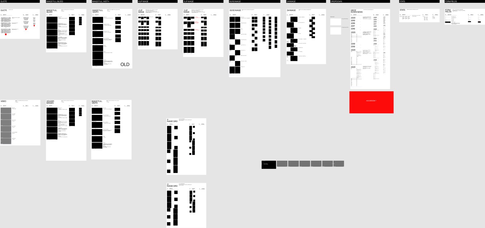
Design system modules
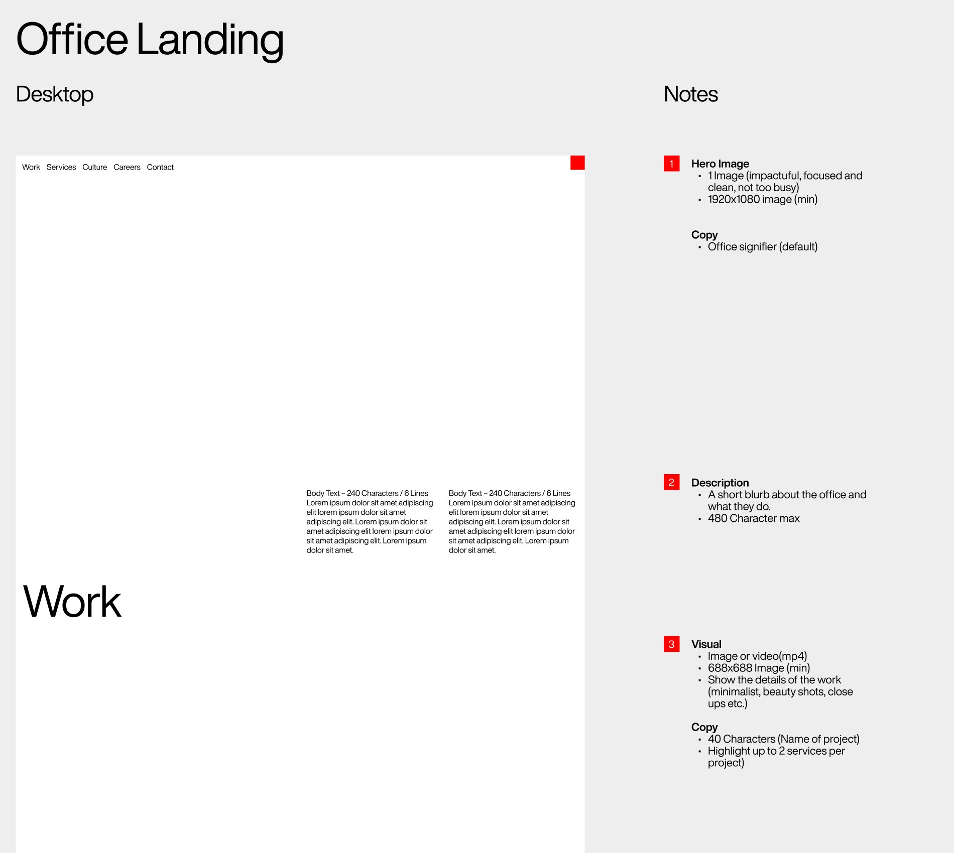
Annotated module specs
Mobile landing page: hero statement
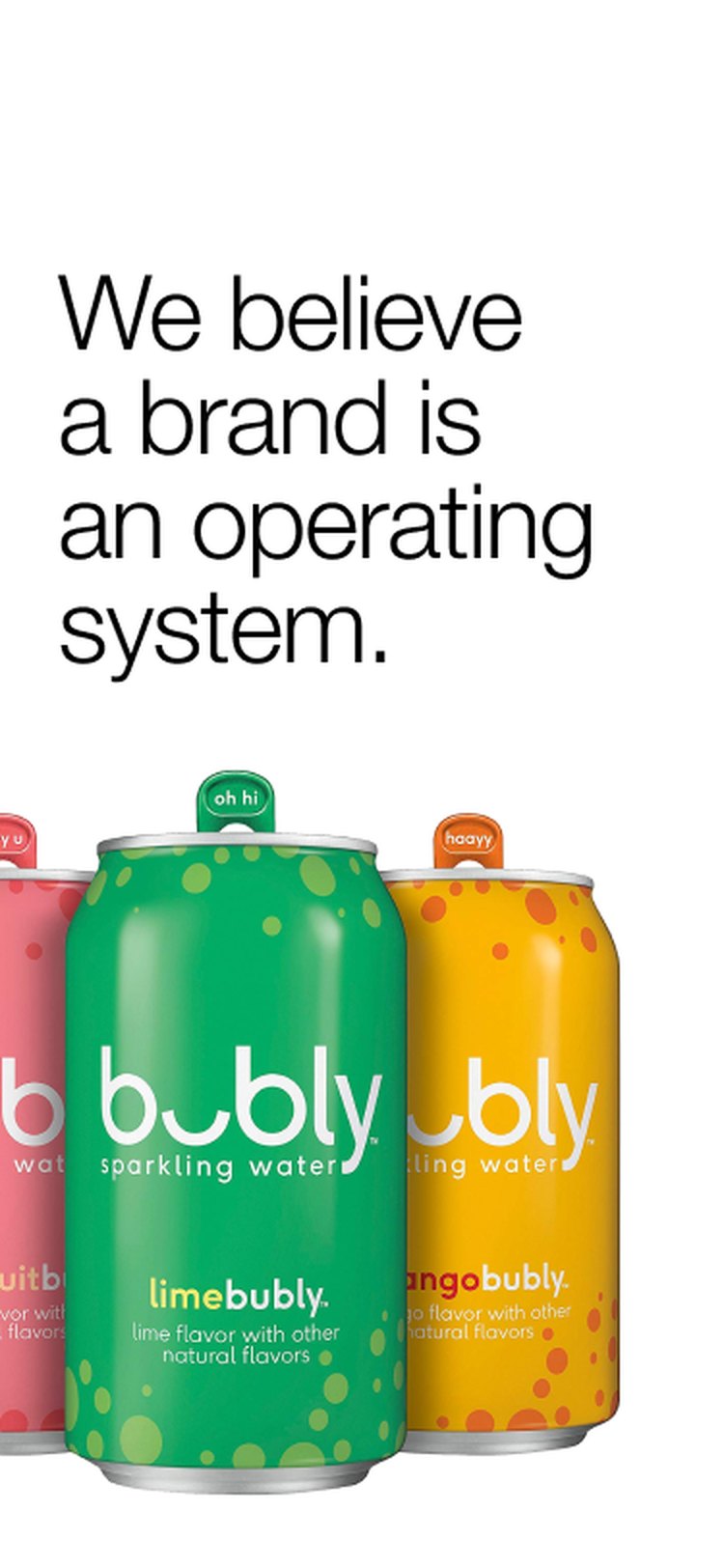
Mobile landing page: bubly
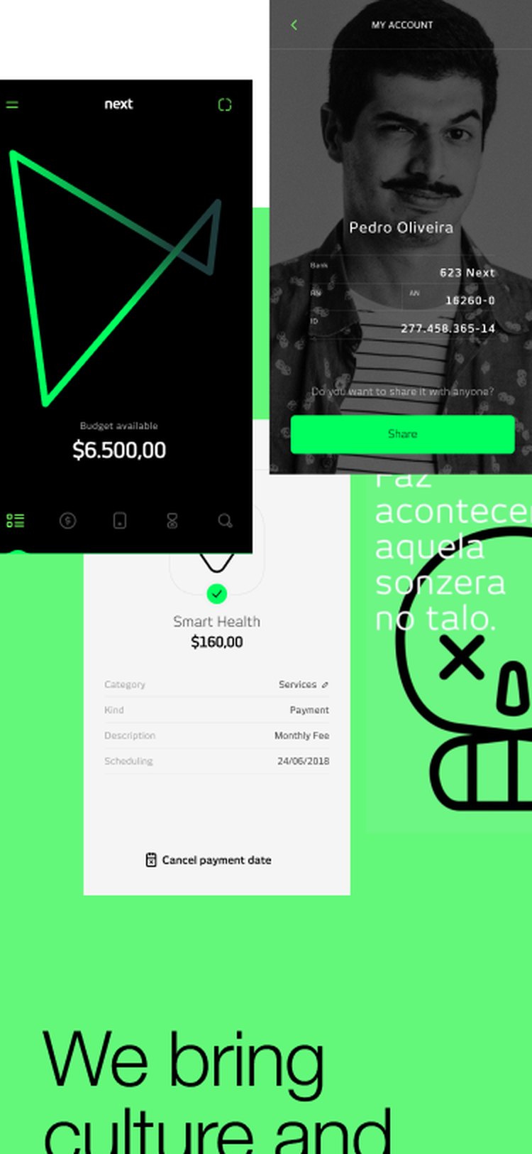
Mobile landing page: culture and CX
Mobile landing page: Sonic
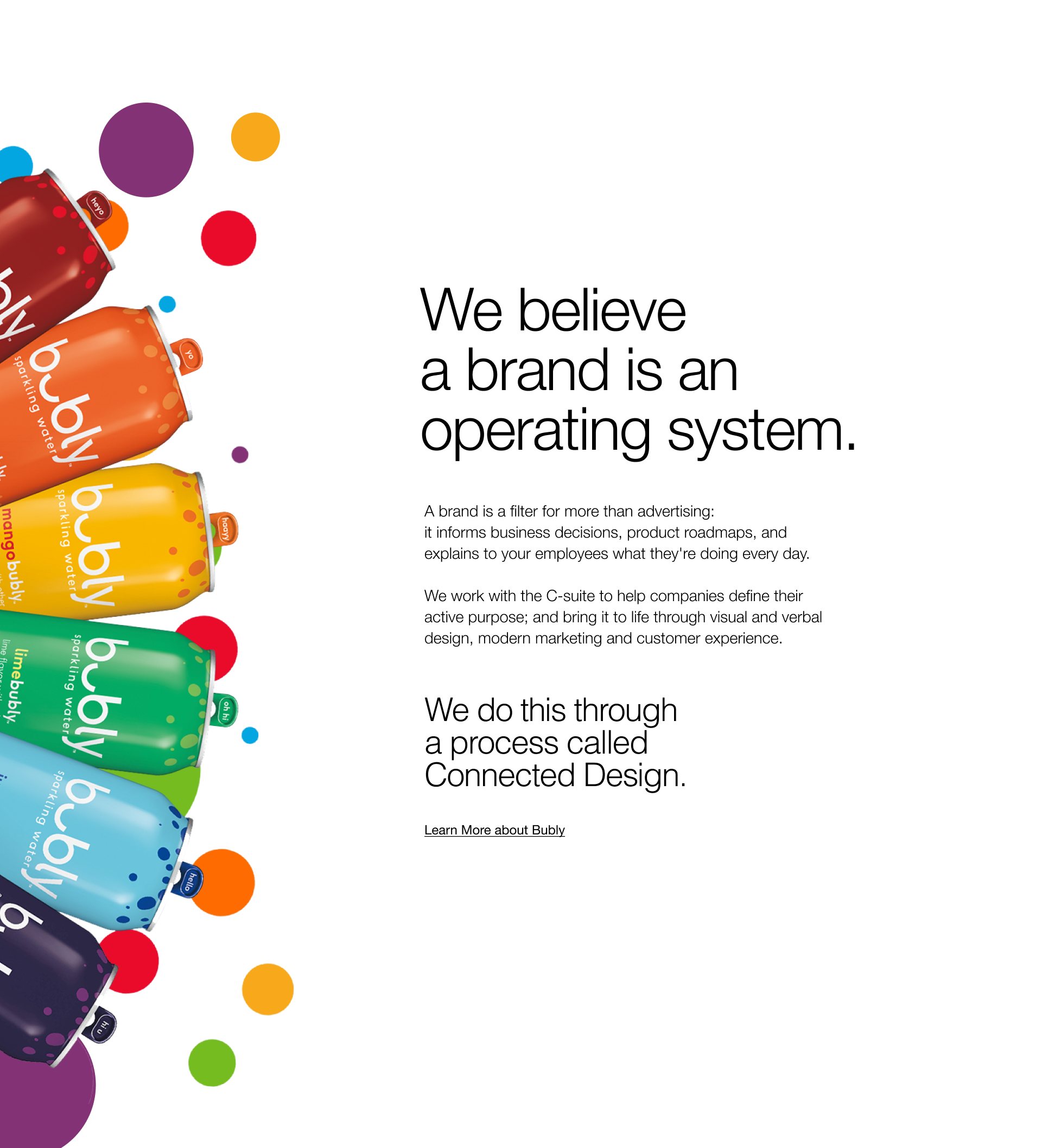
Landing page: bubly, a brand is an operating system
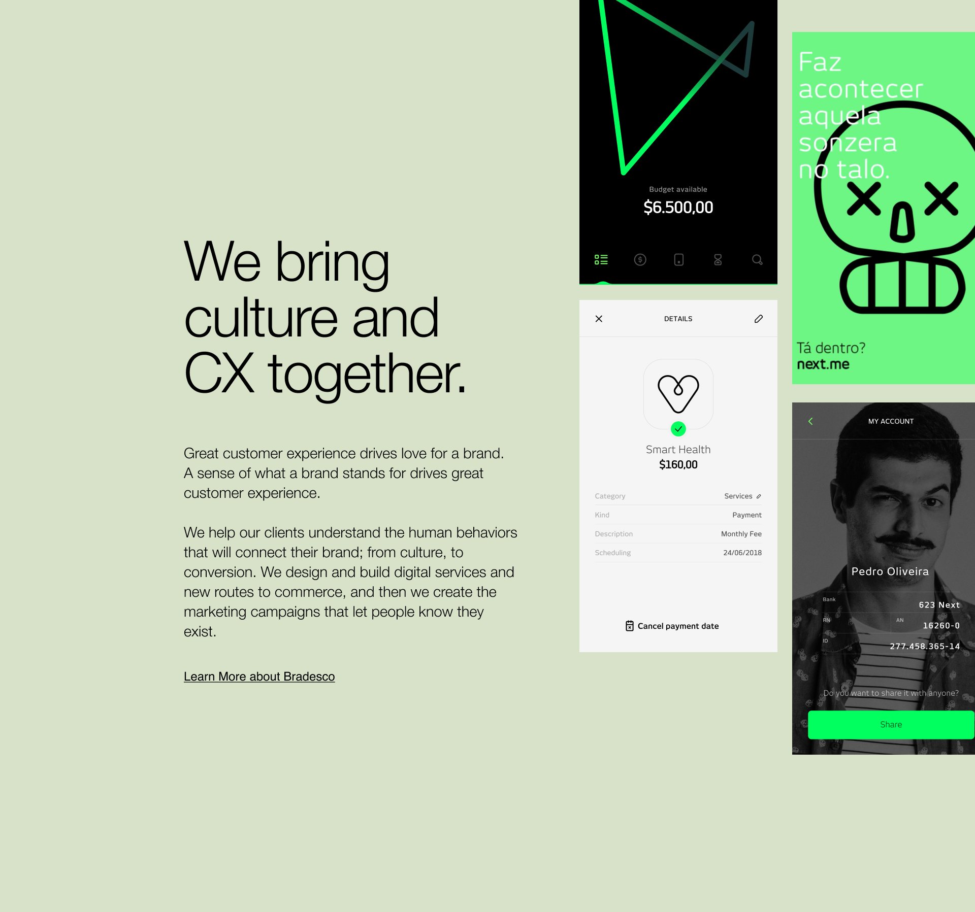
Landing page: culture and CX together
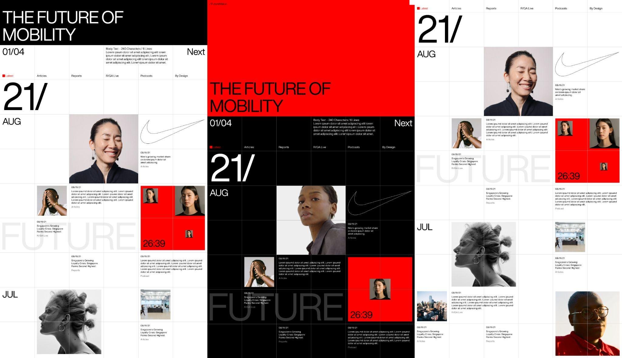
Event pages: The Future of Mobility
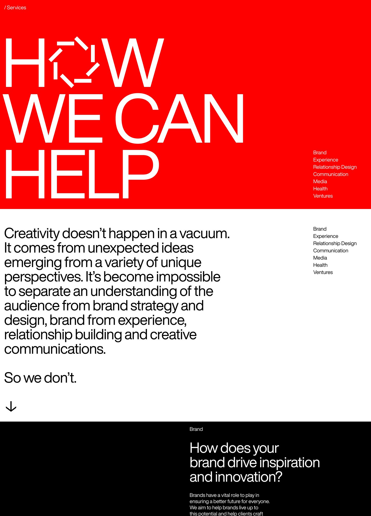
Services page: How we can help
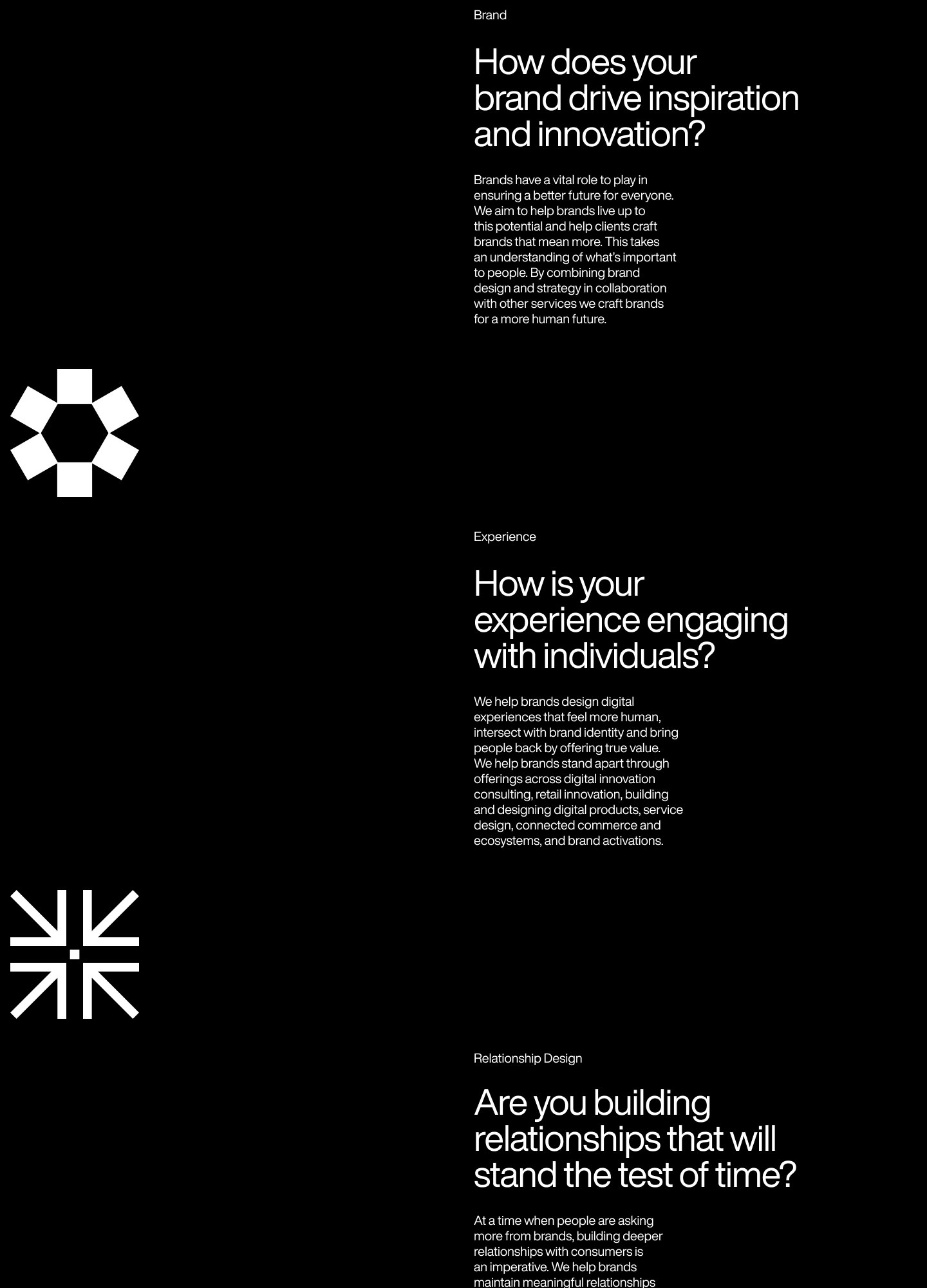
Services page: Brand
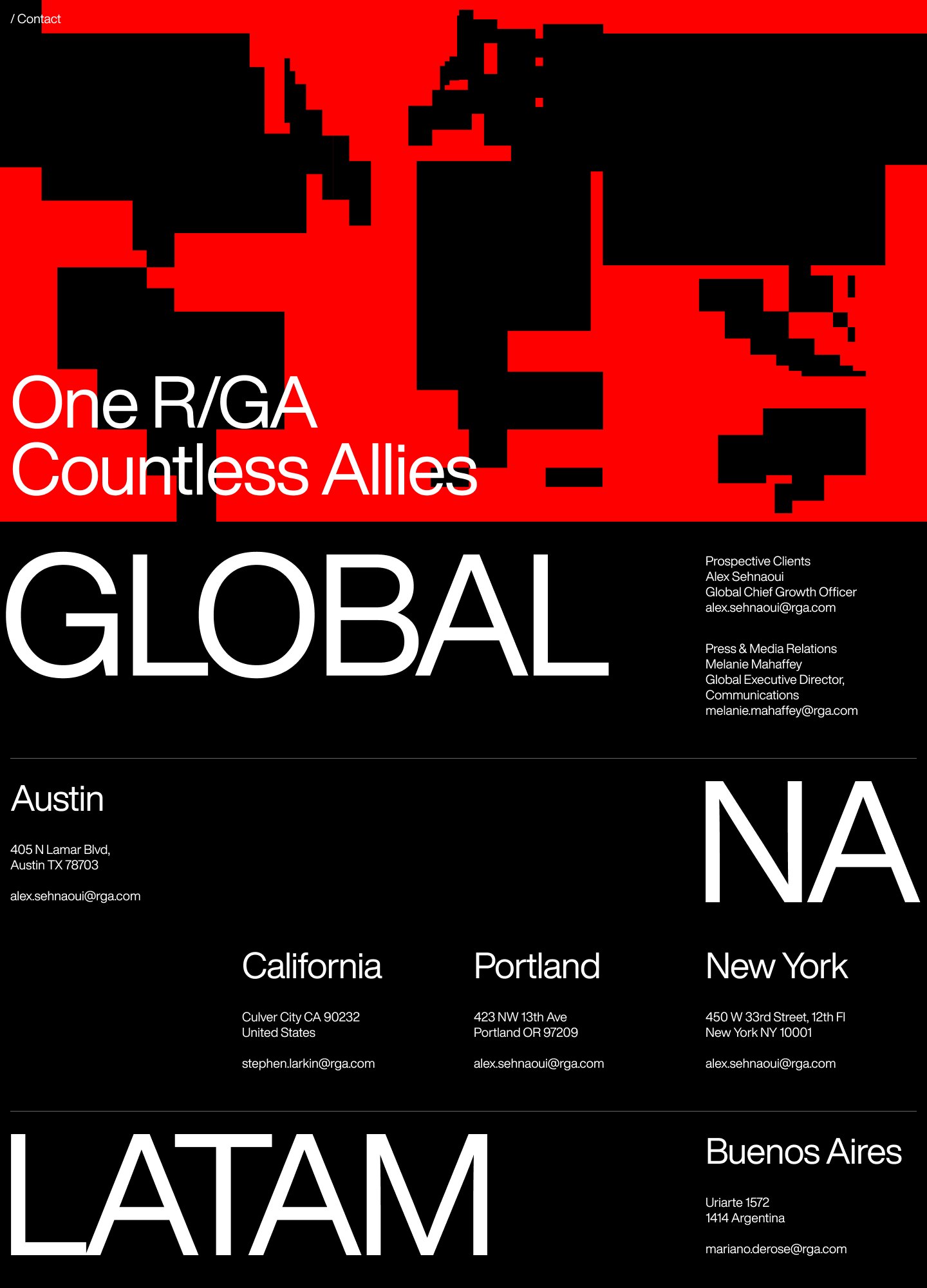
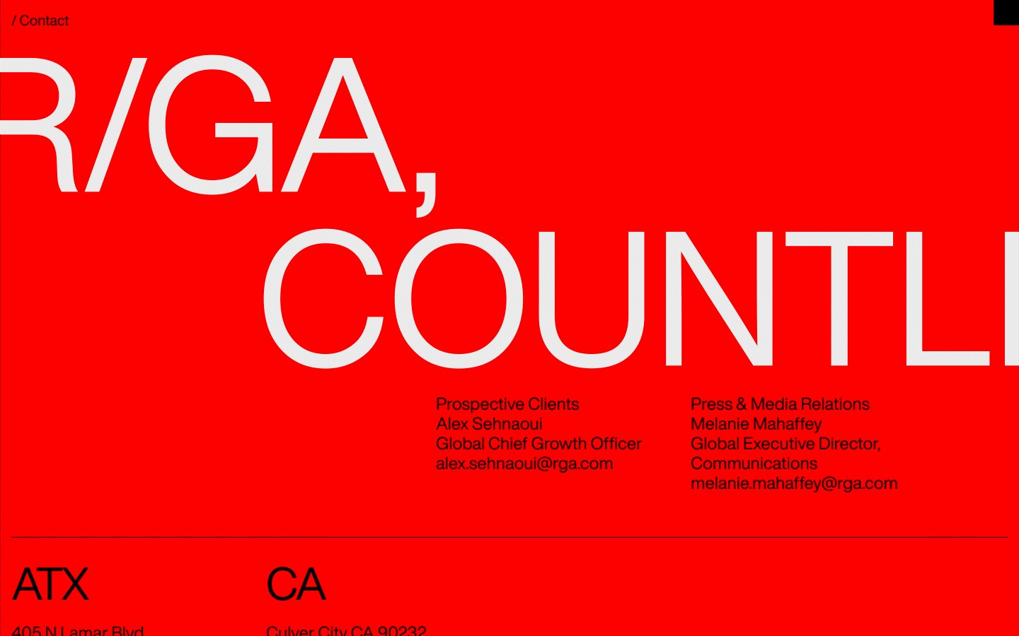
Contact page
BLM story module
Selected work module
125 awards strip
Grid system exploration
Grid map of the network
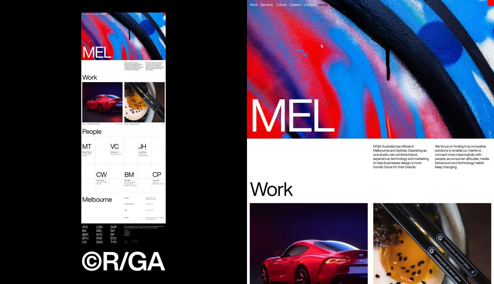
Office page: Melbourne, with people and work
Office grid: /SH, /NY, /LA, /SP, /SGP
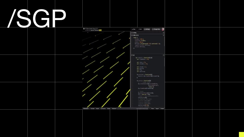
Office page header: /SGP
Articles listing
Singapore office imagery
Landing page: Sonic, new ways to serve people
Landing page: Merch Aid
Contact page: One R/GA, countless allies
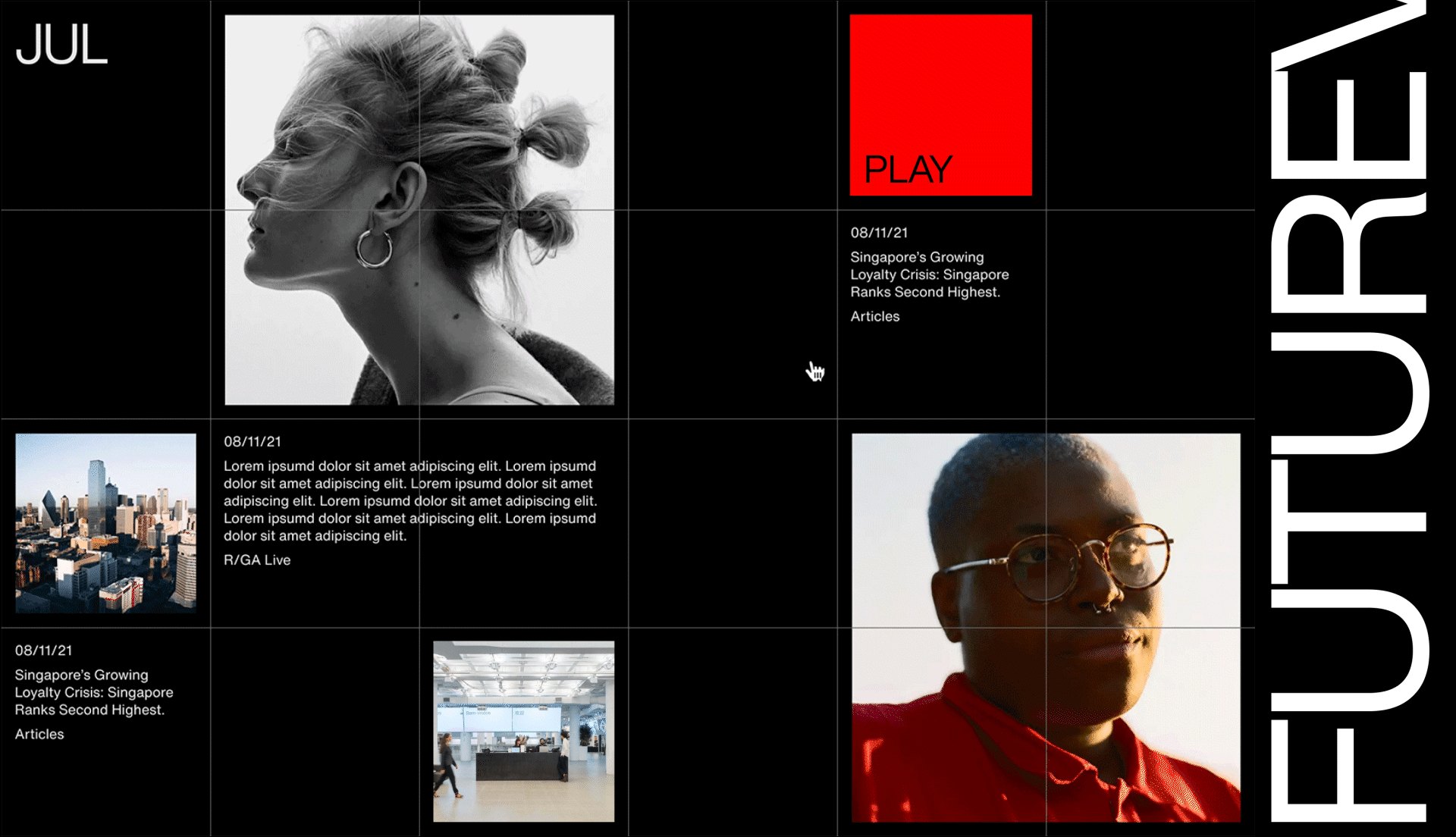
Future-themed event page in black